

Using colour to show how Contruent works for everyone.
Challenge.
Contruent is a robust project lifecycle cost management platform used on some of the largest infrastructure projects around the world. Its value is clear to those who use it, but showcasing that value to new audiences in a way that feels modern, clean, and approachable? That was the challenge.
Rather than default to the typical construction site visuals, Contruent wanted something that reflected the scale and sophistication of the software. The goal was to show how the same platform could serve very different people—from executives to field managers—while reinforcing that Contruent keeps everyone aligned.
Solution.
We created a five-part video series in our studio, with each video tailored to a different user persona. To make each role distinct, we embraced a unique colour environment drawn from Contruent’s brand palette, visually reinforcing the individuality of each job function while maintaining brand cohesion. The result was a clean, compelling, and flexible asset series that both showcases Contruent’s value across job roles and positions the product as a modern, high-trust tool for today’s infrastructure leaders.
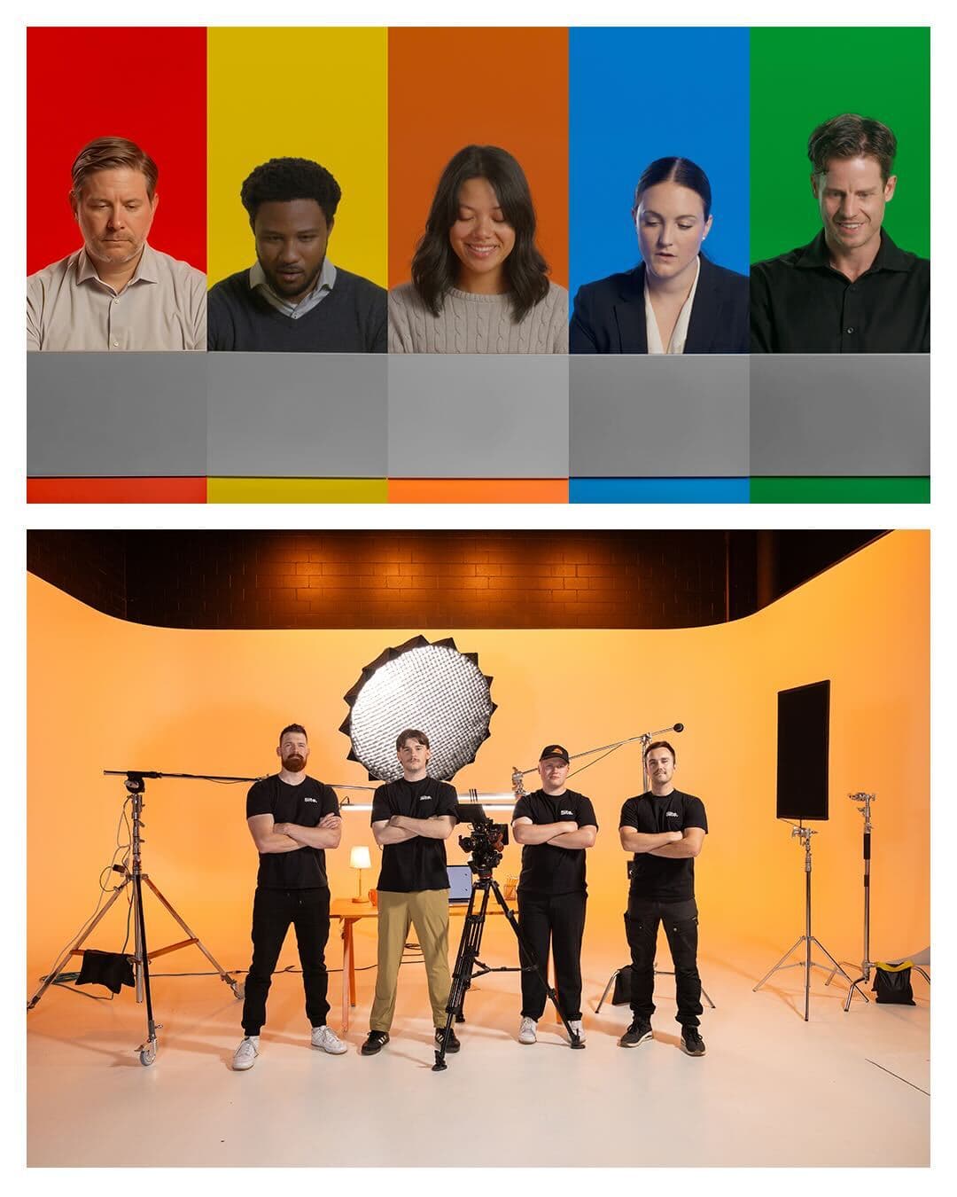
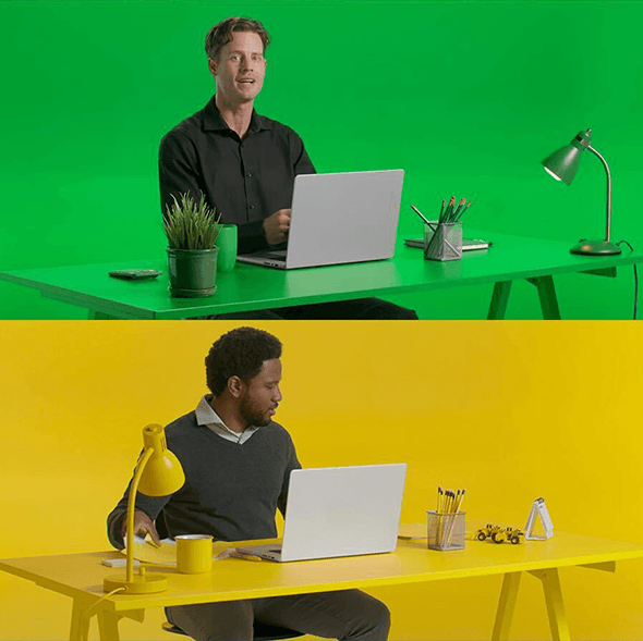
Colour That Communicates
Each video used one branded colour to create a unique visual space for each persona, highlighting how Contruent serves different people in different ways.
Studio-First Strategy
Filming in a controlled studio gave the videos a modern, tech-forward tone, moving away from overused job-site imagery to better reflect Contruent’s refined users.
One Voice, Many Roles
A consistent voiceover connected all five videos, guiding the viewer clearly through the software’s benefits while allowing each role to shine.