Table of Contents.
Mission & Vision.
Positioning.
We are the full-service marketing partner for the industrial sector, elevating the industry through creative branding and communications that any other industry would aspire to produce. But while our expertise is focused on this "niche" (and that's a big niche), our work transcends it because we aren’t boxed in by it. Yes, we know the industry inside out. But we know better than to do things the way they’ve always been done. To our clients, we bring perspectives and skills from a world outside their own, while being able to speak their language and understand their business like no other marketing partner. And it's this unique offering that allows us to not just help them with marketing. But make them famous for it.
How Do We Do It?
We ideate and create using small teams to produce incredible work for all forms of media: digital and traditional. We know our clients are often in the same industry, but we reveal what makes them different by finding the right strategy and messaging for them. We know speed is a competitive advantage, but we don't fly by the seat of our pants or do cutter-cutter work. We take the time to do it right, striking the perfect balance between speed and precision.
What Do We Do?
We reveal the differentiating factor for companies who want to stand out in all areas of their marketing. Then, we produce creative marketing that shows that clearly. Our process is proven, but our product is far from pre-packaged. Think of us as the custom builder of the marketing world. No job or client is the same. And once our work is done, our clients' branding and marketing proves it.
Why Do We Do It?
We're from this industry. We love this industry. We're for this industry. But we also get that this industry is subject to the same marketing laws and pitfalls of any other industry. This being the greatest law/pitfall: great brands with a great product or service can only go so far without great marketing. So for any company that wants to stand out in a sea of sameness, we’re here to elevate them above the rest.
Think of us as the custom builder of the marketing world.
Logomark.
The Site logo is a vital component of the Site brand identity. As such, it needs to be used appropriately and consistently across all printed and on-screen applications. Misuse of the logo will weaken the messaging of our brand. In order to preserve consistency with our identity, never attempt to recreate the logo. The proportions and position of the logotype should never be altered.
2.1 Logo Concept.
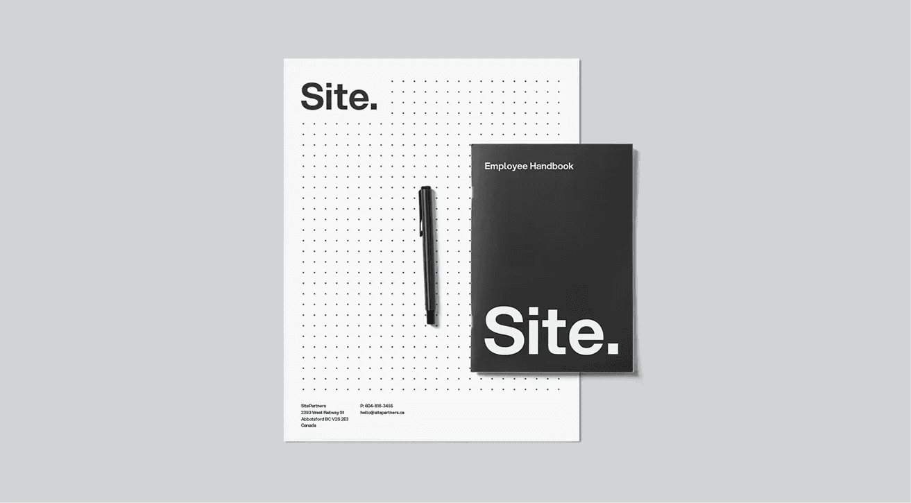
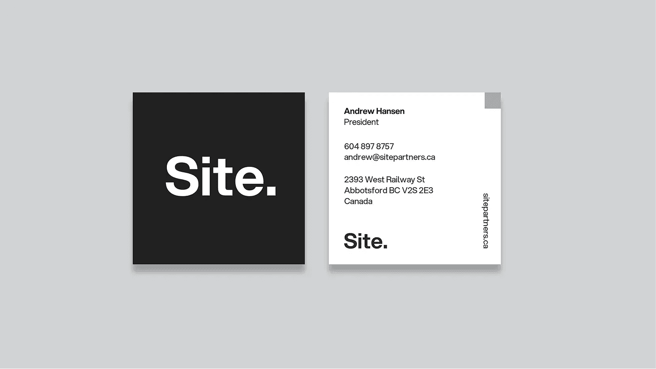
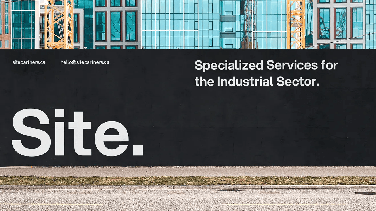
Our logo is described as a wordmark style logo. The typeface used is Aspekta in 650 weight. The period (AKA the Building Block) at the end of our name is the graphic device that anchors our brand. The Building Block is used as a conceptual tool and visual element throughout our brand identity. To ensure legibility, our logo is always surrounded by an area of clear space which remains free of other design elements, such as type and other logos.

2.2 The Building Block.
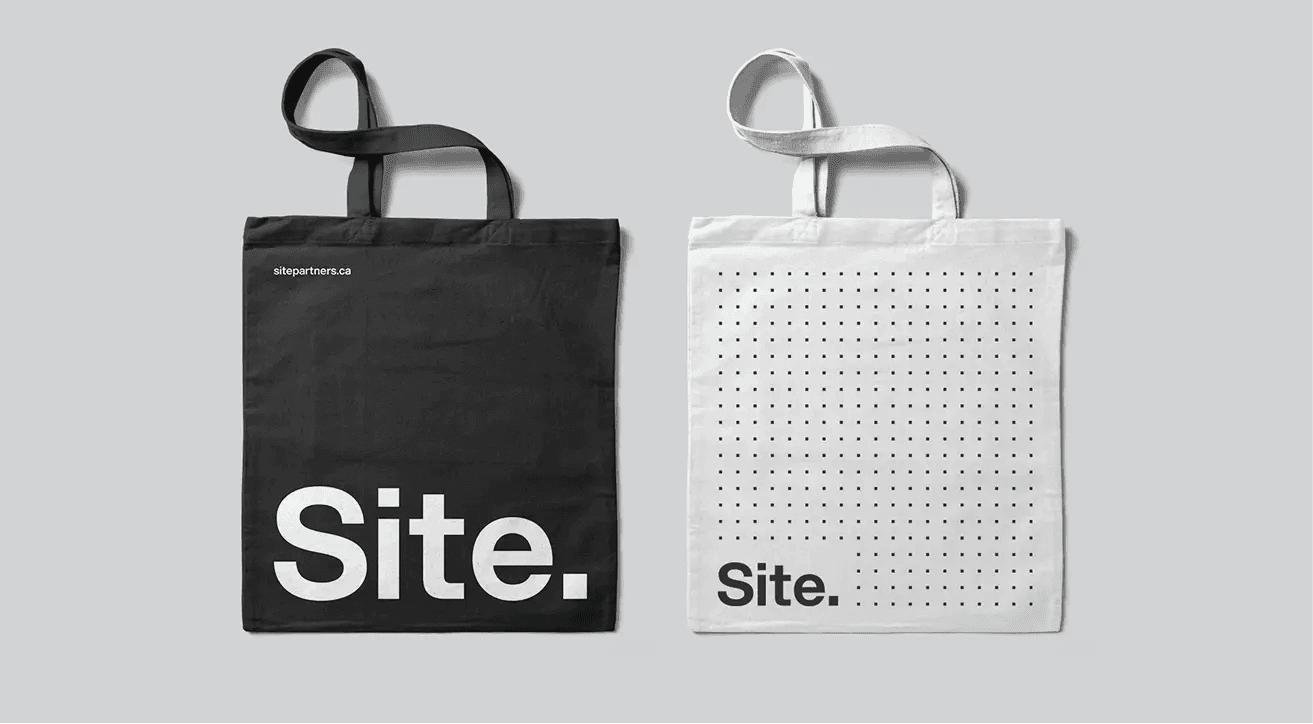
The building block is a simple but foundational brand element. It's used to punctuate anything of importance. That includes headlines in our copy, titles for our Google Slides, displaying names of our team members for lower thirds in interview videos—pretty much anywhere possible. It's subtle within our logo, but everywhere in our brand. Example: it can be used as a background grid-style texture, or used to frame up images or keywords, or to build our simple abstract icons. It can be a solid shape or outlined with a stroke. Basically, anywhere it can be used to reinforce our brand, we do it.
2.3 Logo Application.
Our logo has two colour variations: Positive (Dark, which is or our Onyx colour) and Negative (White, which is our Carbon colour). When the Site logo is placed on a photo, the image behind the logo must be light enough to provide contrast for the positive logo or dark enough to provide contrast for the reverse logo. The background should also not have too many distractions behind the logo that would interfere with it’s clarity.


2.4 Minimum Size.
To maintain full legibility, never reproduce the logo at widths smaller than 0.5 inches (for print) or 50 pixels (for screen). There is no maximum size limit, but use discretion when sizing the logo.
Note: Due to monitor resolutions and view settings, example shown may not be to scale.

2.5 Operating Companies.
Below are the logomarks for the Site brand operating companies. Each logomark is set in Aspekta typeface in 650 with the period in its corresponding brand colour.
- SitePartners.
- SiteTalent.
- SiteProductions.
- SitePursuits.
- SiteMedia.
- SiteJobs.
- SiteVentures.
- SiteAI.
Brand Colours.
The Site primary colour palette consists of five colours. The following guidelines should be followed whenever creating original printed or on-screen pieces for Site. Only use CMYK colours for print jobs. When producing designs to be viewed digitally, including websites, use RGB or HEX colors so that the colours appear properly on screen.
Onyx
CMYK 0 / 0 / 0 / 94
RGB 53 / 53 / 53
Hex 353535
Graphite
CMYK 0 / 0 / 0 / 80
RGB 86 / 86 / 86
Hex 565656
Slate
CMYK 0 / 0 / 0 / 50
RGB 150 / 150 / 150
Hex 969696
Stone
CMYK 0 / 0 / 0 / 20
RGB 211 / 211 / 211
Hex D3D3D3
Carbon
CMYK 0 / 0 / 0 / 5
RGB 239 / 239 / 239
Hex EFEFEF
3.1 Secondary Colours.
The Site secondary colour palette consists of ten colours. Each colour relates to a corresponding Site operating company. These colours can be used sparingly on certain creative brand applications. Only use CMYK colours for print jobs. When producing designs to be viewed digitally, including websites, use RGB or HEX colors so that the colours appear properly on screen.
SitePartners
CMYK 0 / 0 / 0 / 50
RGB 150 / 150 / 150
Hex 969696
SiteProductions
CMYK 92 / 70 / 2 / 0
RGB 34 / 92 / 167
Hex 225CA7
SiteMedia
CMYK 70 / 35 / 0 / 0
RGB 74 / 142 / 204
Hex 4A8ECC
SiteVentures
CMYK 80 / 12 / 42 / 0
RGB 0 / 165 / 161
Hex 00A5A1
SiteTalent
CMYK 0 / 100 / 0 / 0
RGB 236 / 0 / 140
Hex EC008C
SitePursuits
CMYK 0 / 100 / 95 / 0
RGB 237 / 0 / 41
Hex ED1C29
SiteJobs
CMYK 0 / 35 / 90 / 50
RGB 251 / 176 / 52
Hex FBB034
SiteAI
CMYK 13 / 0 / 82 / 0
RGB 230 / 230 / 80
Hex E6E650
Typography.
Consistent use of typography helps to make our brand identity strong and cohesive across all applications. The typeface Aspekta was selected to complement the voice and tone of our brand. Aspekta Sans Serif Font is a modern, neo grotesque family that consists of 20 weights. Inspired by a clean, simple and neutral style.

4.1 Type Hierarchy.
For headlines and important information we typically use Aspekta 650. For smaller text like website body copy, use Aspekta 400. See example below as a reference for type setting.

Brand Values.
Everything we do is built on our values, and it should always show in our work. They are the reason we come into work every day, ideally not considering it work at all. These values represent how passionate we are for this industry and why we believe in it. They enable us to see things from a unique vantage point, and they ultimately allow us to produce work that makes competitors say: "I wish we did that."
- Lead with Care.
- Roll Up Your Sleeves.
- Own the Work.
- Be Curious.
- Make an Impact.
Brand Voice.
Most think success in the industrial sector is built on word-of-mouth, reputation, and relationships. That’s what it was. That’s not everything anymore. Marketing is changing. And so is the industry. Fast. What will shape the next generation of leaders in this competitive space is exceptional branding, storytelling, and experiences—and backing all that up with real services. At Site, that’s what we do. We’re brand-builders, storytellers, and experience-shapers for industrial brands that know creativity is a competitive advantage. And we specialize in all forms of it, from strategic planning to video production to in-depth branding to web development to full-blown advertising campaigns. We’re here to reshape the industrial sector for the new era by elevating the brands that aspire to redefine it and lead it. And our voice is what tells the world: this is who we are.
What We Say.
For the Industrial Sector.
When you need to build a brand or send a message in some of the most complex industries, you need a marketing partner who gets it—and gets creative. That’s why we focus all of our expertise on one thing: creative marketing for the Industrial Sector. There are plenty of creative agencies who are Jacks-of-all-industries. We’re are masters of this one.
What We Don’t Say.
We Are Specialized.
We believe that to produce good work, you must be specialized. At Site, we work exclusively with partners in the industrial sector. You won’t find anyone like us, and we are proud of that. We understand the market, industry players, and business challenges. We start from a position of knowledge and experience, that no other agency can match.
Brand Tone.
We’ve created a tone of voice that represents who we are to the people we employ and the people watching from the outside. This voice is crafted to set us apart from any other agency, but also make it known that we are For the Industrial Sector. We aren’t a mirror of the industry, trying to identify with or pander to them. We are THE name to aspire to partner with for any industrial company that wants their name known and their story told. And we’ve crafted a voice that makes that clear by making these words the definition of who Site is:
Creative.
Creativity is the first word that should come to mind when people think of us. Not just for our creative work, though. Literally everything: our strategy, our processes, our portfolio, and our brand voice. Let's just say we don’t follow business standard writing. We're not trying to get an A+ on a 12th-grade English paper, here. We write like our people talk.
Obsessive.
We are marketing nerds and industrial-sector experts to an almost unhealthy level. And our voice shows it—not just tells it. We're obsessed with great marketing and making it work for a sector that we obviously know really, really, really well.
Punchy.
In our writing, we cut to the chase. We don’t mince words. But we do use them to their fullest by getting creative with structure, headlines, and style.
Awesome.
Not to brag (and our voice should never come across that way) but we are the coolest people in the industry. When people hear or read our voice, they should think, "I want to hire them, work for them, or just be them."
Confident.
Enough said.
Applications.

Imagery.
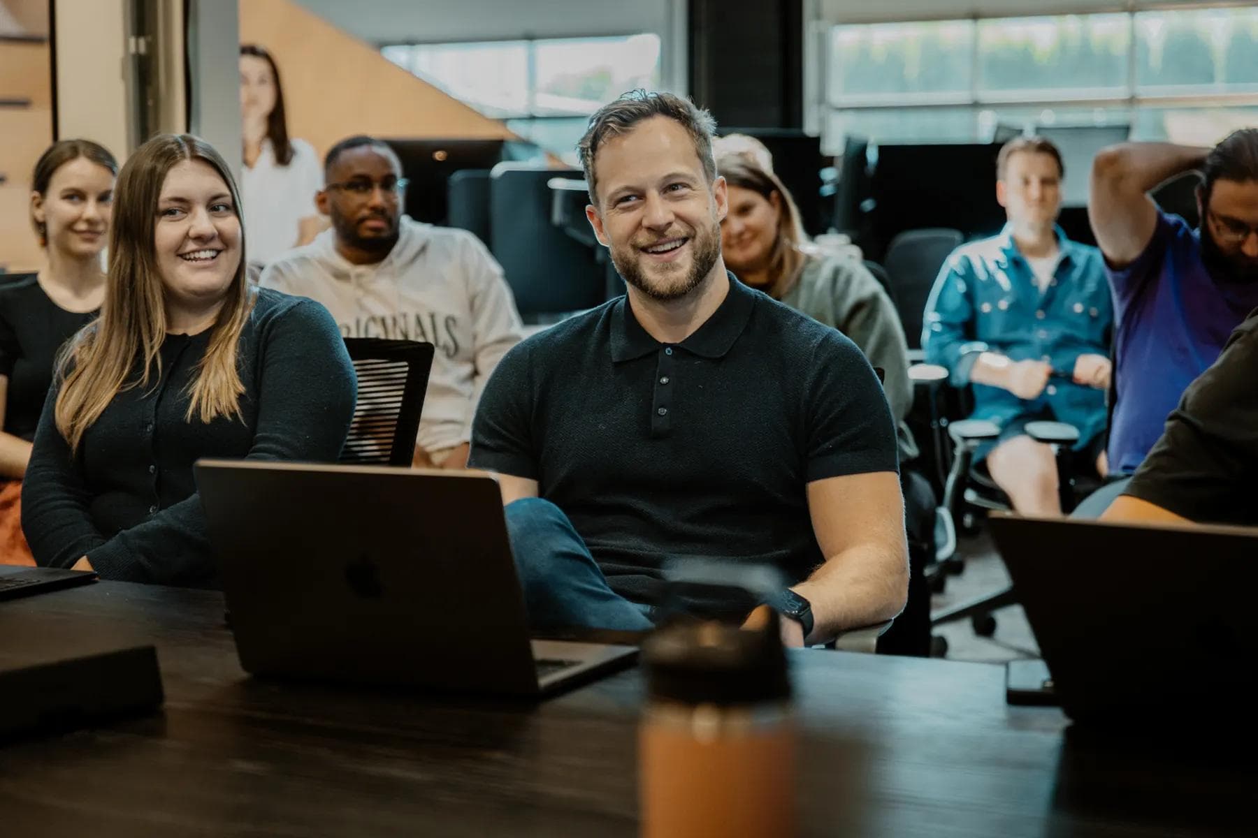
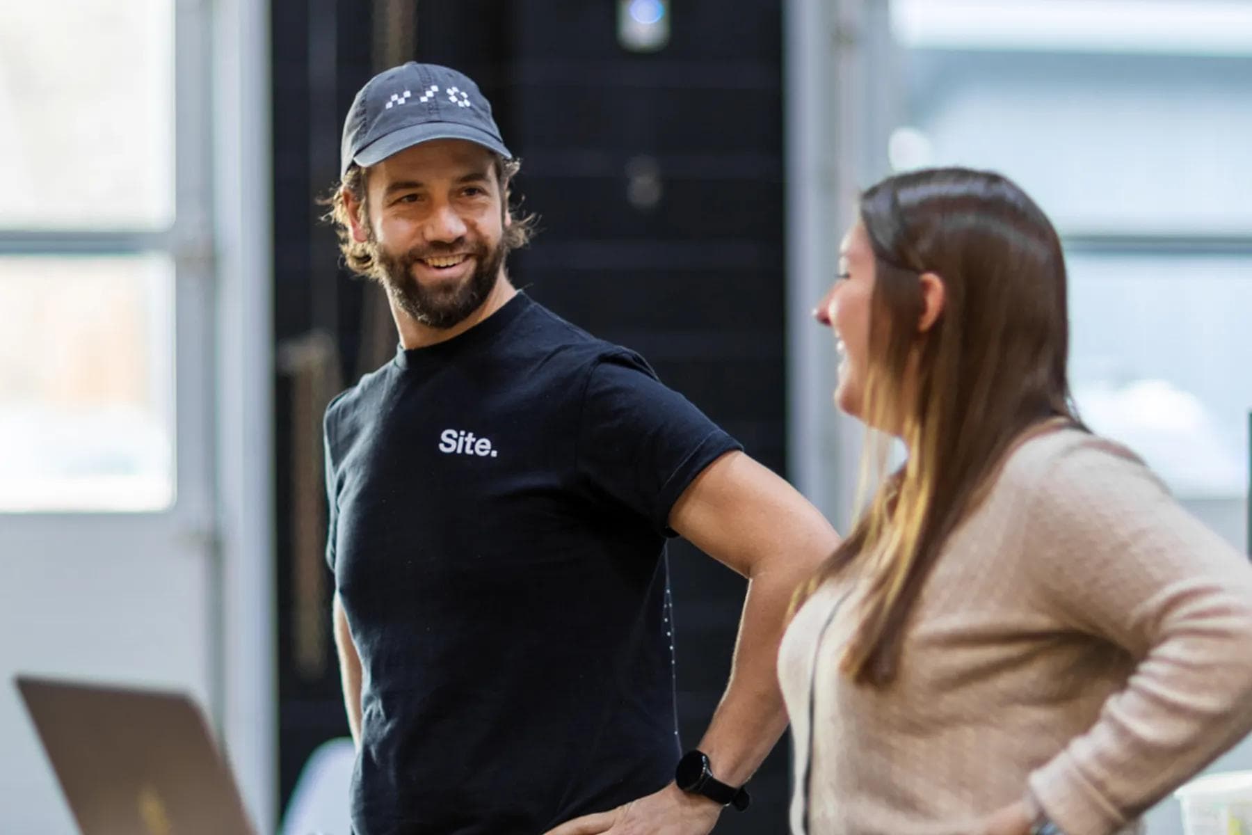
Our imagery should always be in keeping with our brand. The imagery should be clean, bright and have a sufficient amount of contrast and saturation. People and community are key values to the Site brand Therefore, it’s best to feature imagery with people—individually or as part of a team.


People.
BTS.
On Site.
Office.
Events.
Community.
SiteSwag.
Social.
Photography.
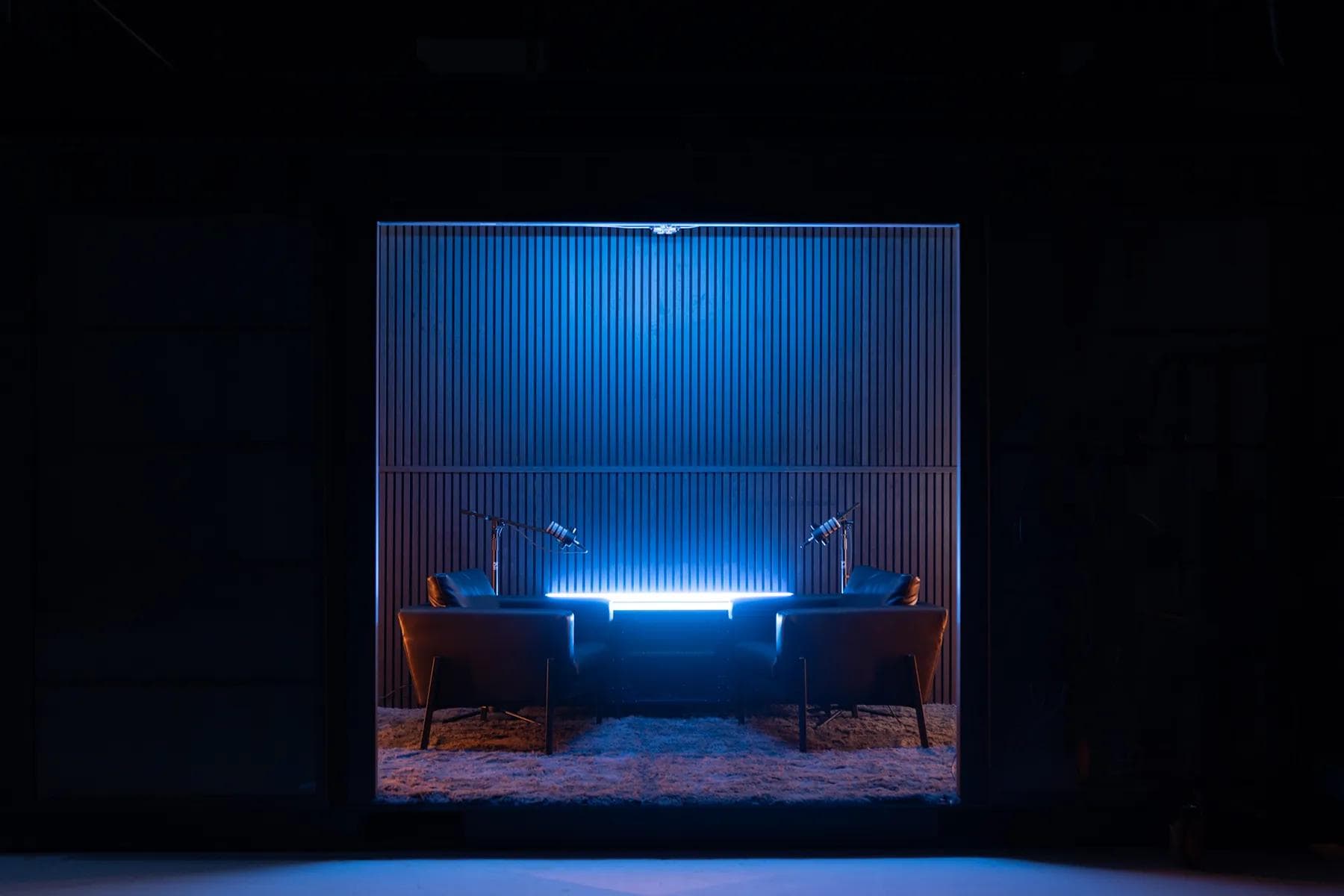
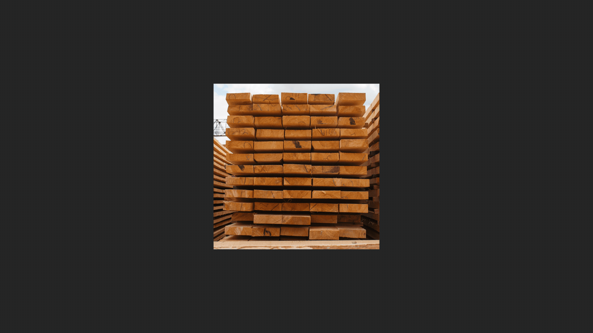
Our own brand's photography is dynamic, with intentional lighting and an undeniable professional (but still gritty) edge. For candid imagery, we capture action and movement. Our work is active and takes place in epic locations, so our photography should show that. We do not overtreat it with filters. We keep it clean, professional, and real, whether we're in the field or in-studio.
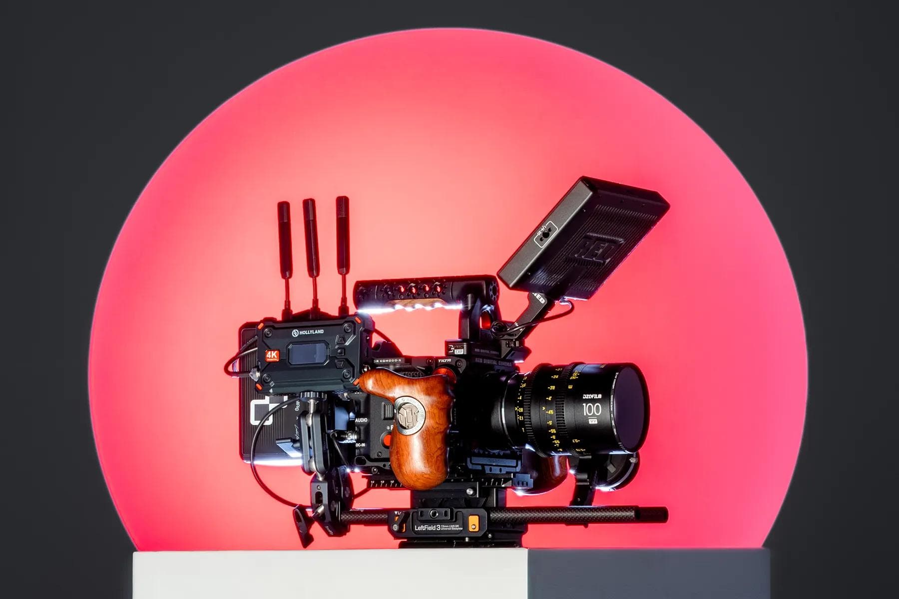
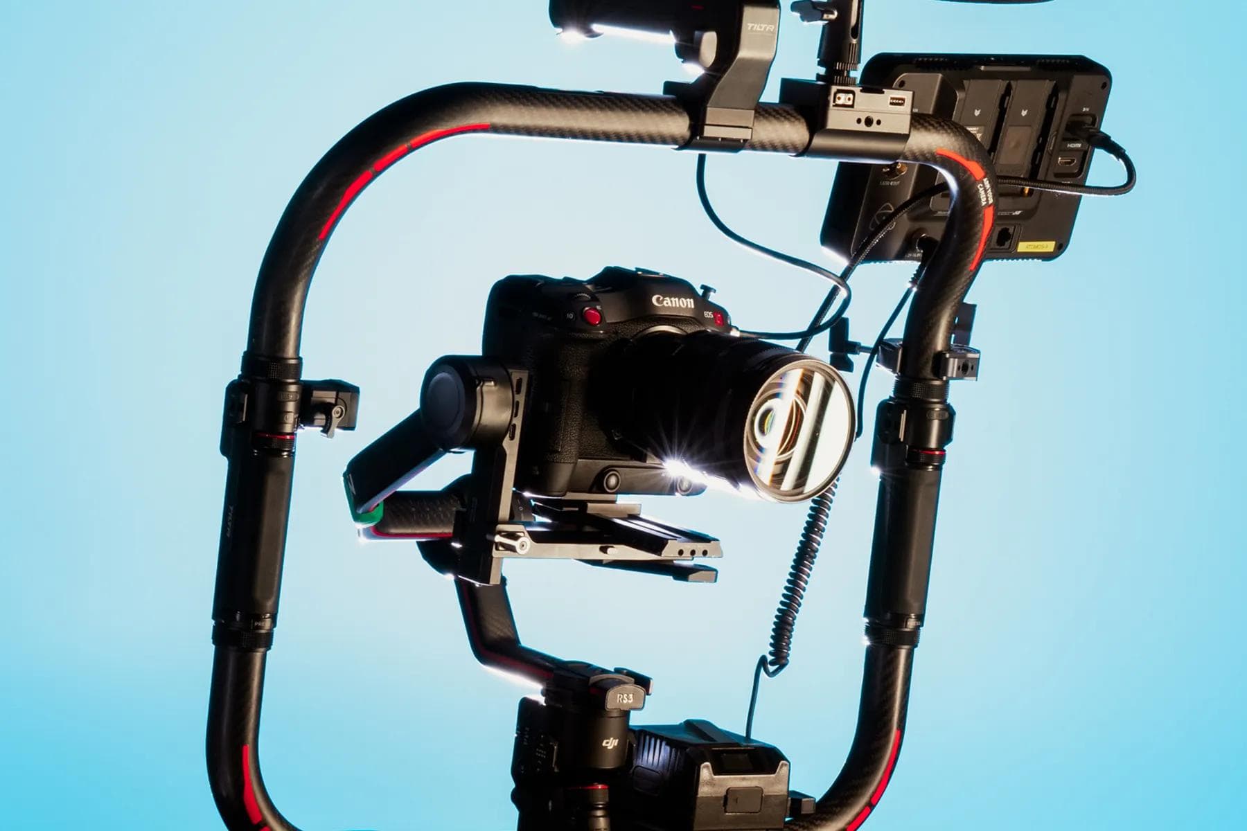
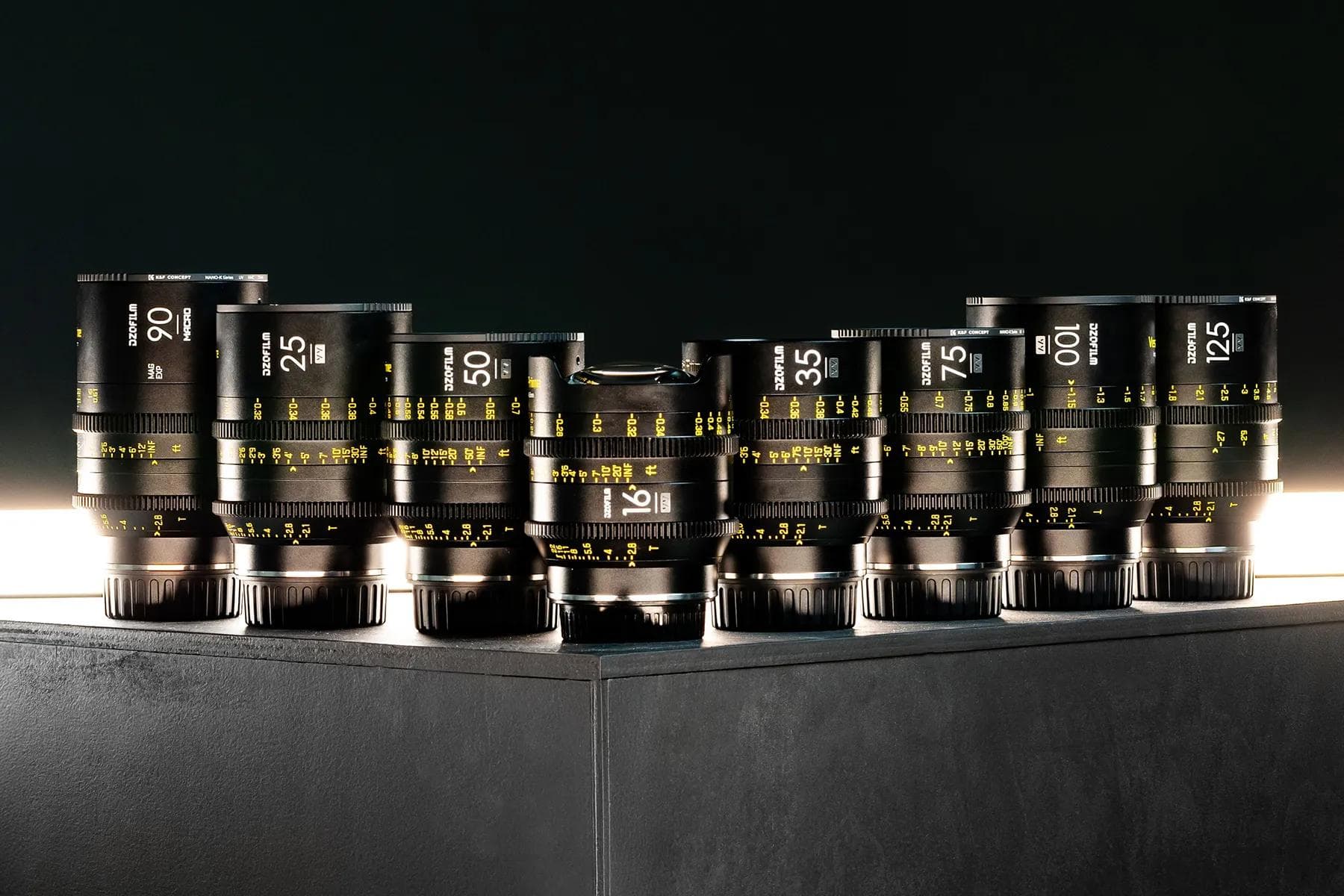
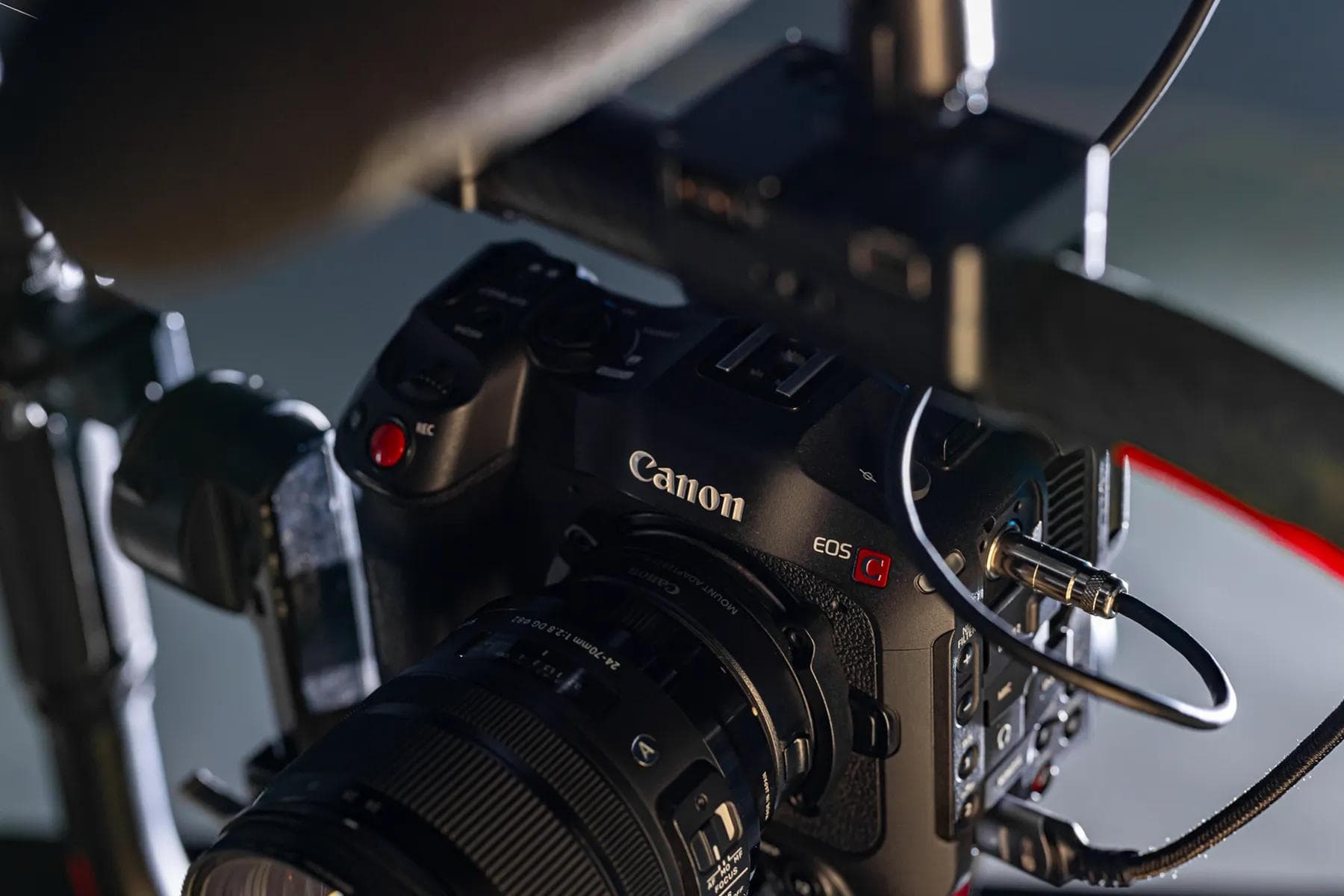
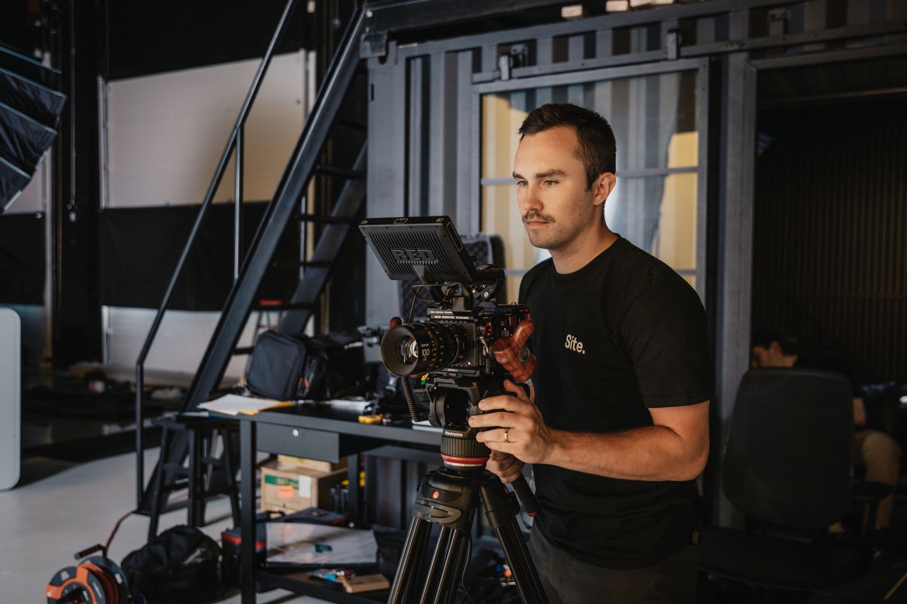
Gear.
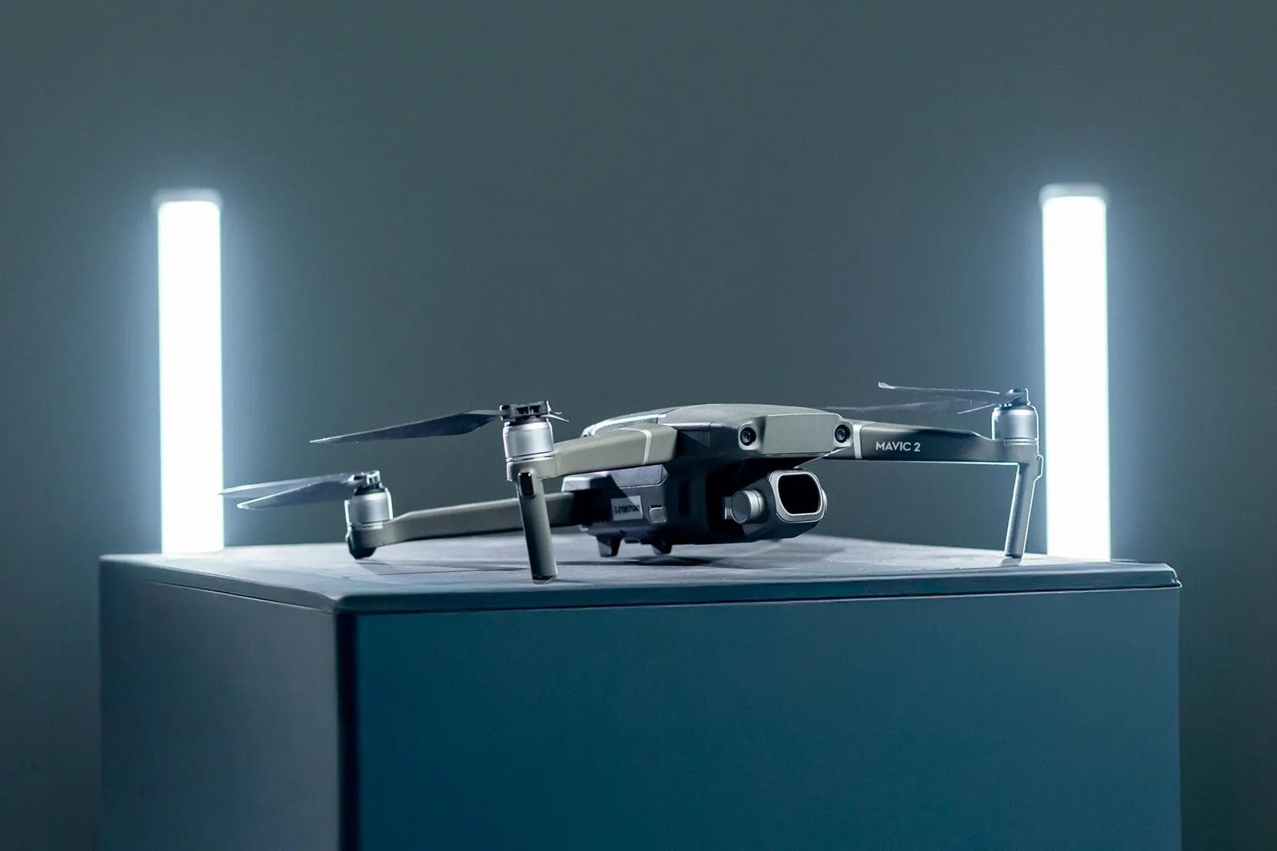
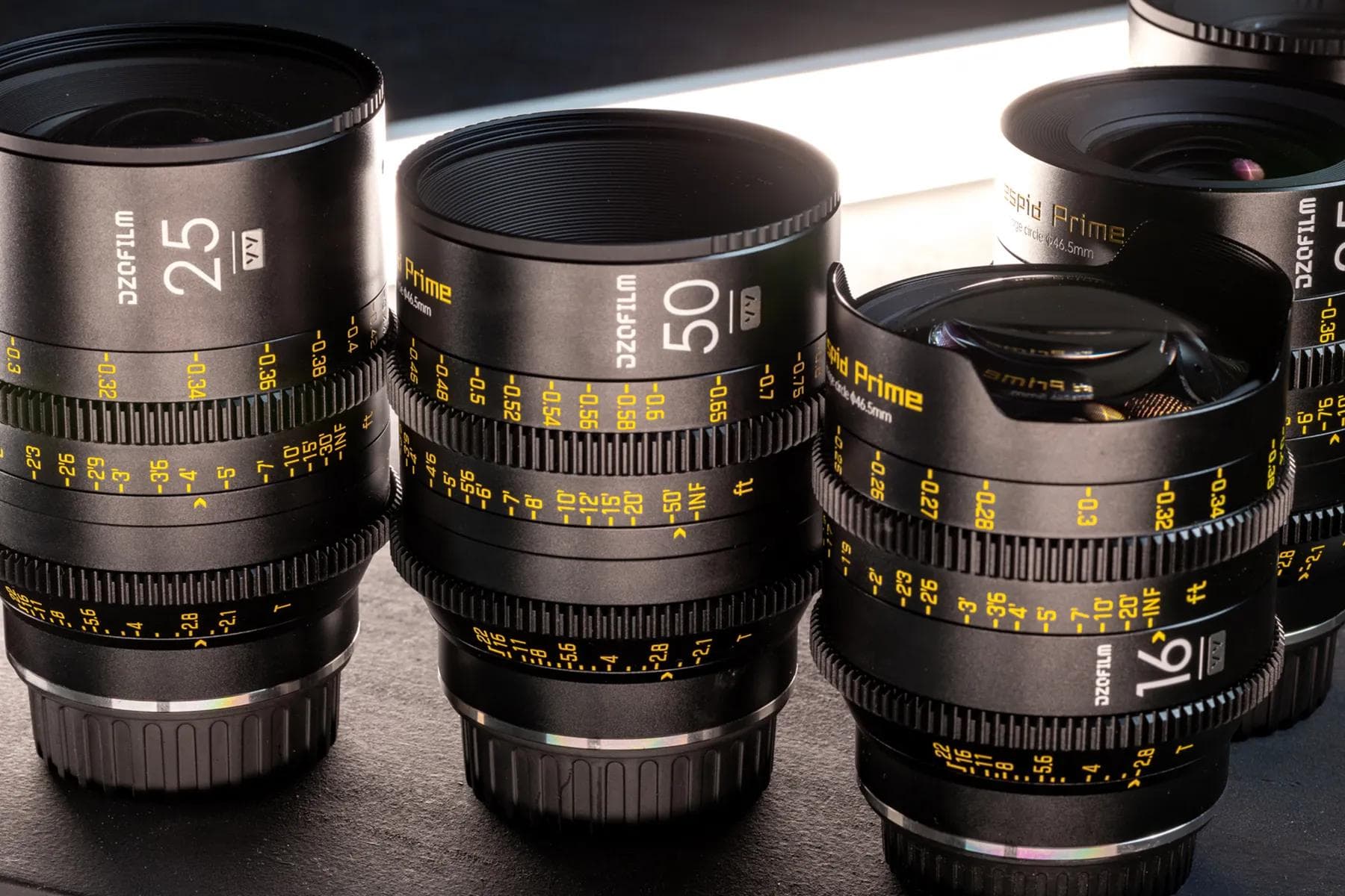
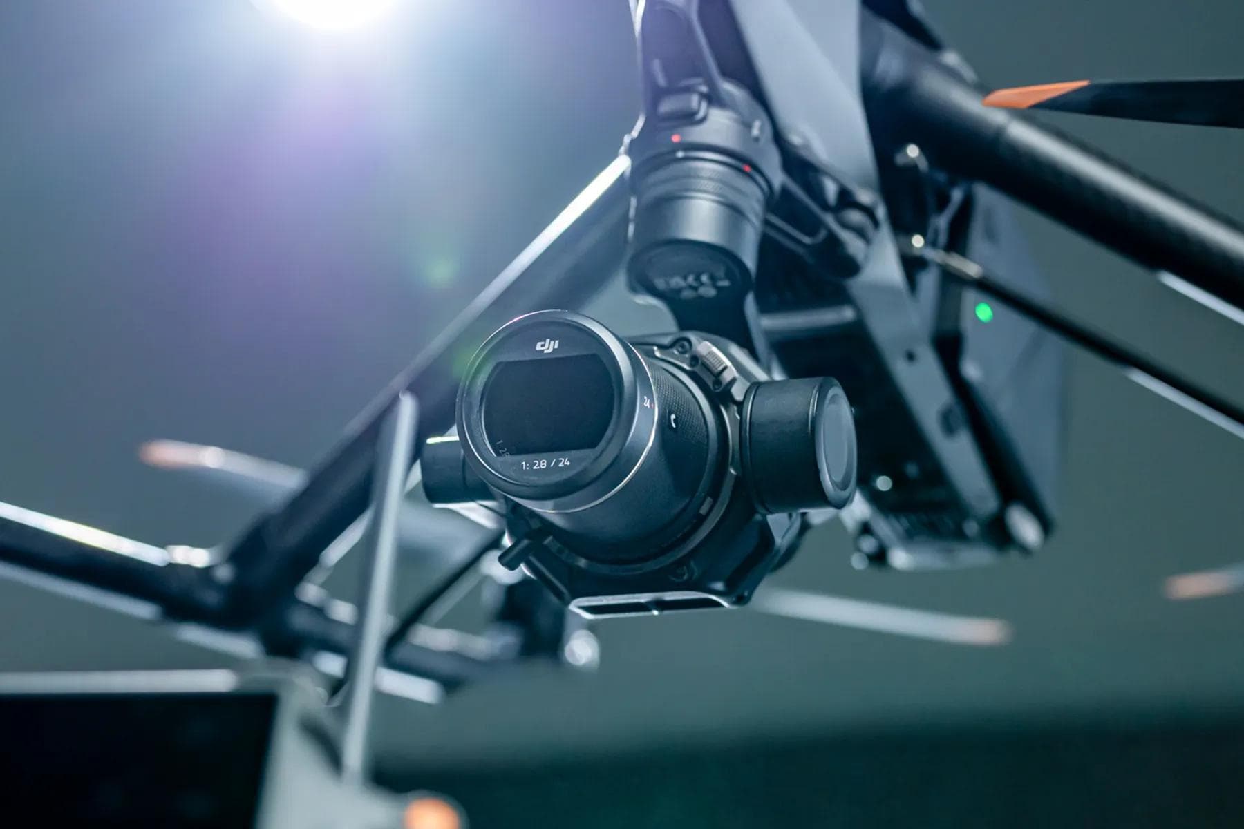
Taking photos of our photography/videography equipment? How meta of us, right? Showcasing the tools of our trade (and the premium brand equity they embody) is a major selling point for our services and a complement to our brand. So photographing this equipment (from RED to Canon to DJI) elevates us just by associating ourselves with quality tools.
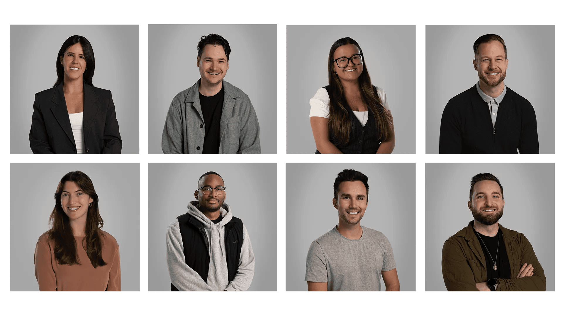
Headshots.
Our headshots are simple. We shoot them in our studio with our classic three-point lighting setup, with subjects sitting on a tall stool. We always instruct our staff to look casual but avoid slouching. (Sorry to sound like your mom, but sometimes people just need a reminder.) Subjects should be centred, looking into the camera with a slight turn of the torso towards the key light. The background is later colour corrected to match our "Slate" grey.
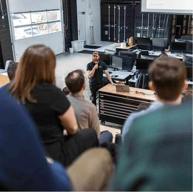
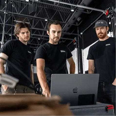
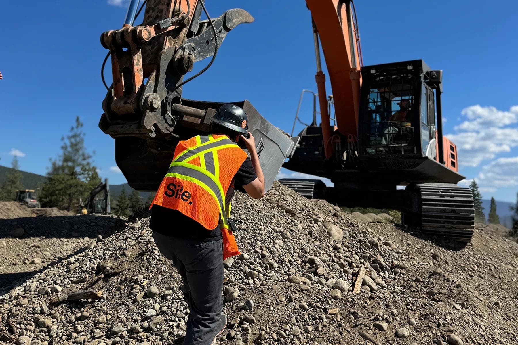
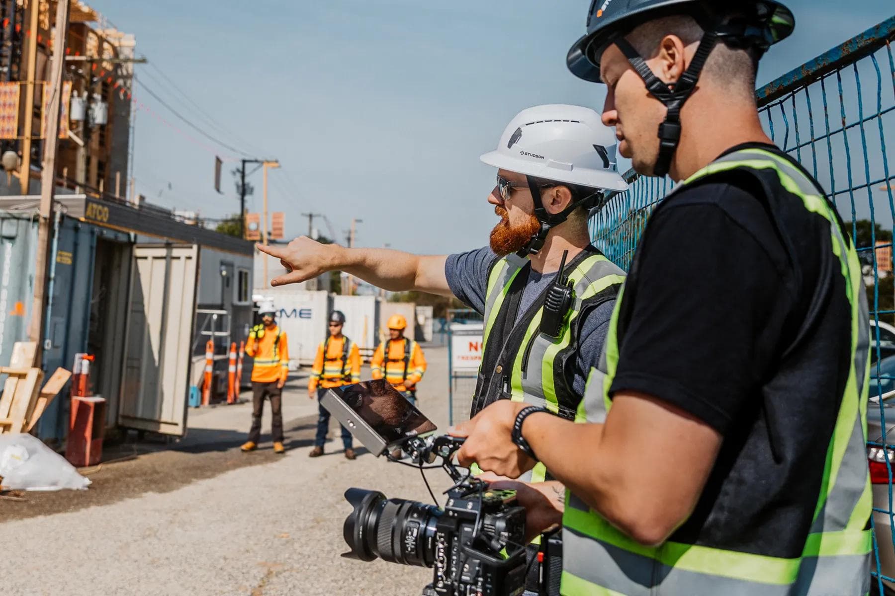
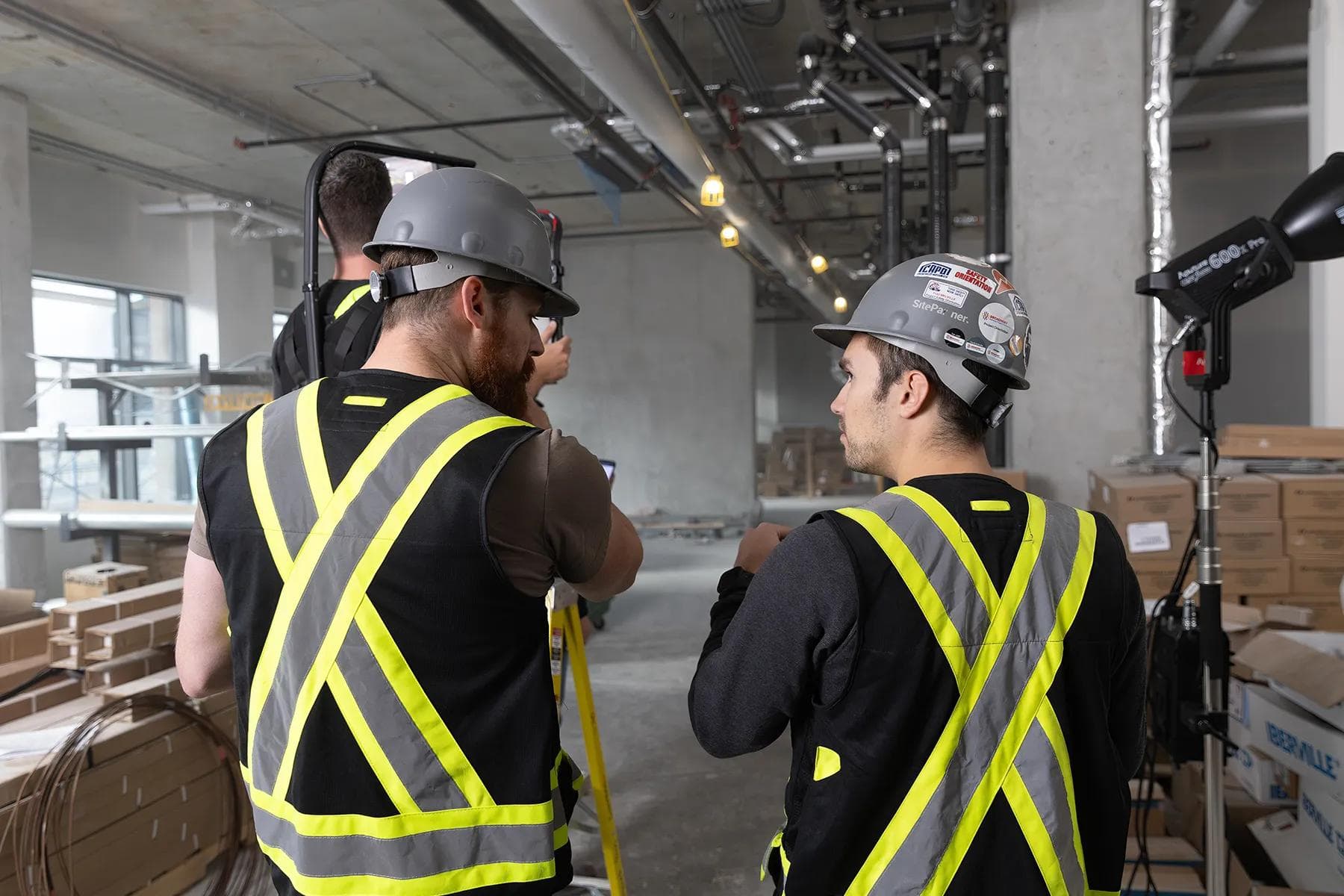
On Site.
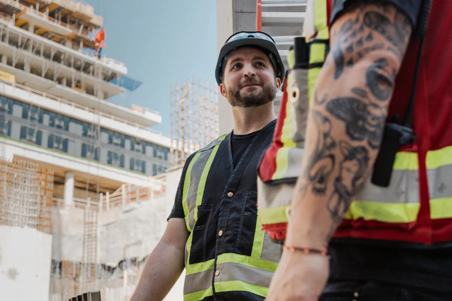
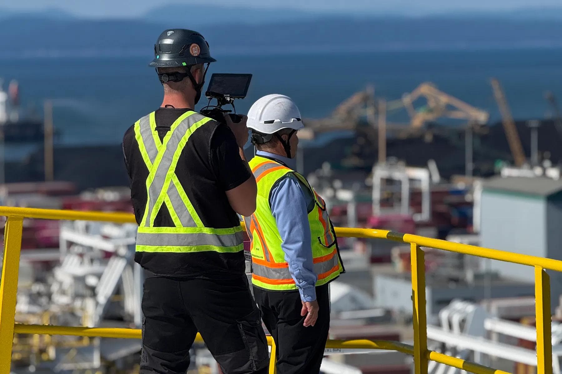
On site is where the action happens, and photography of our team working there should capture it. Proper use of PPE is mandatory when photographs are being taken in this setting; otherwise, we can't publish them. Final photo treatments shouldn't look over-edited, but final retouching should feel real, raw, and professional—just like the places we work.
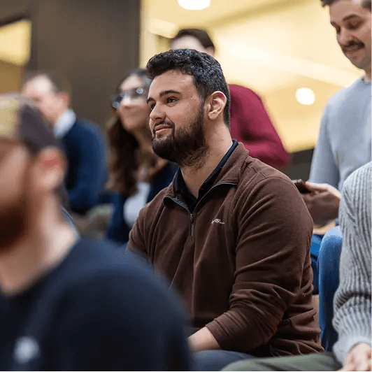
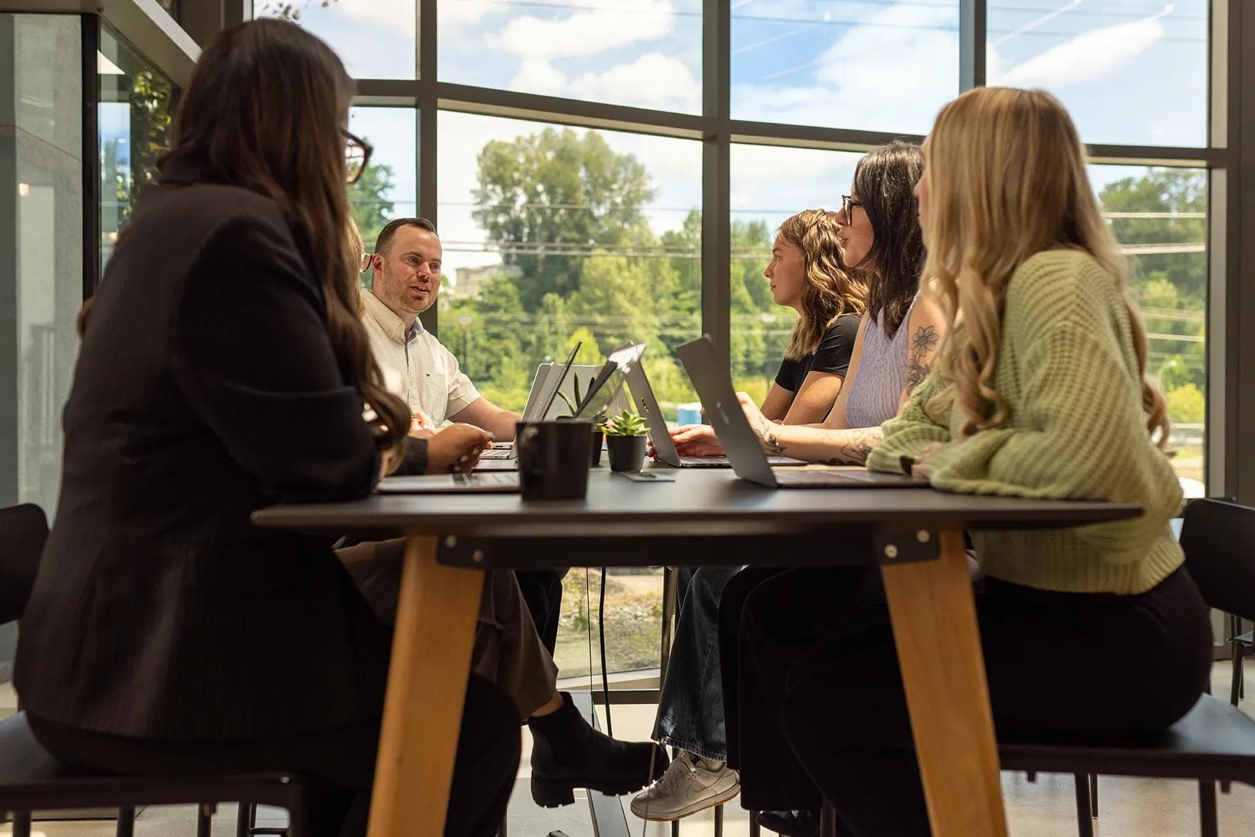
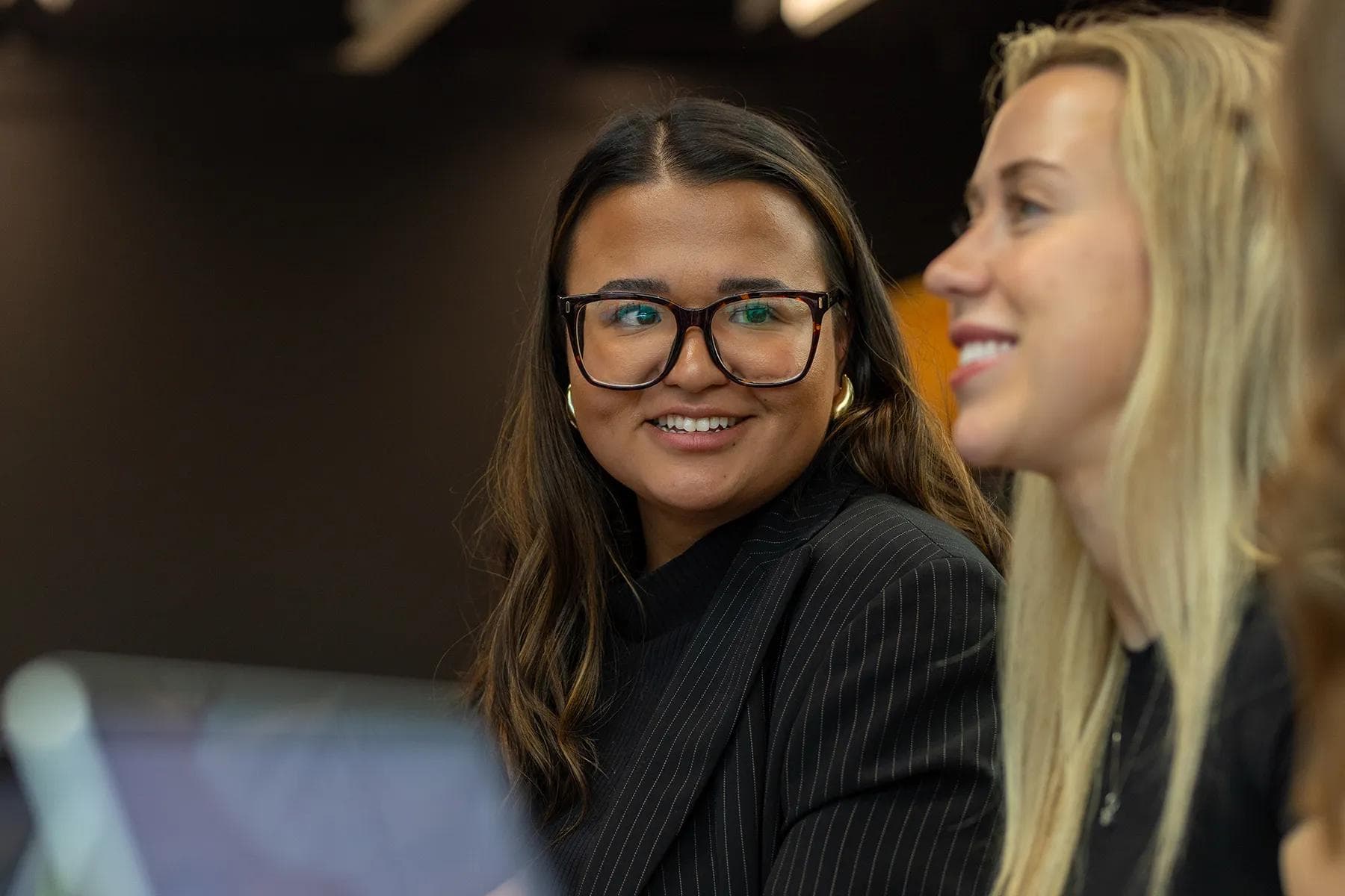
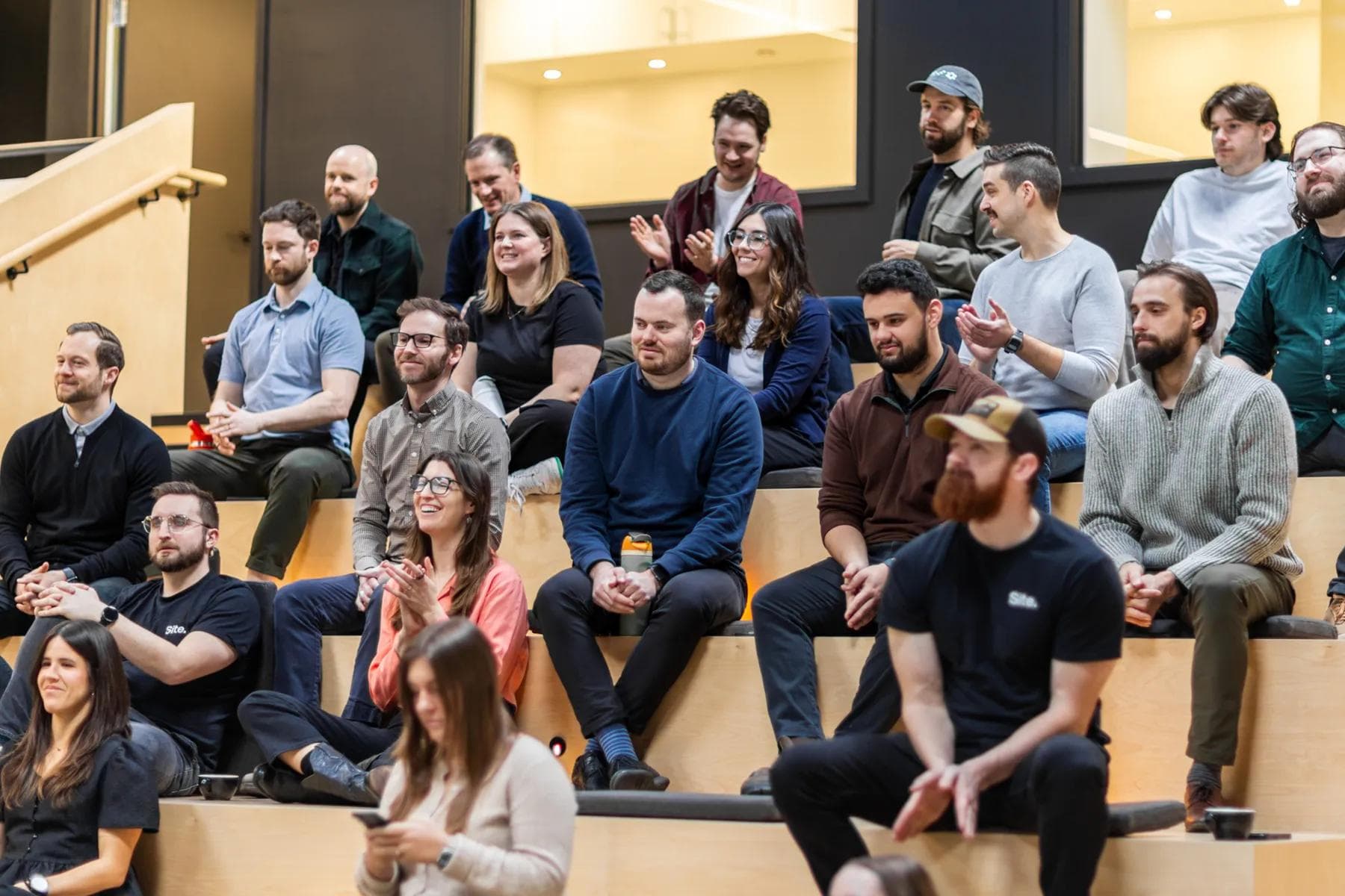
Candid.
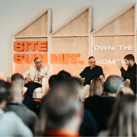
In-office, candid shots are something we can and do capture often. Whether it's our team enjoying work, collaborating in a break-out area, or concentrating on a speaker at SiteDay, our candid photos should show our culture of people who love their work. Look for organic lighting, flattering angles, and backdrops that add depth and texture.

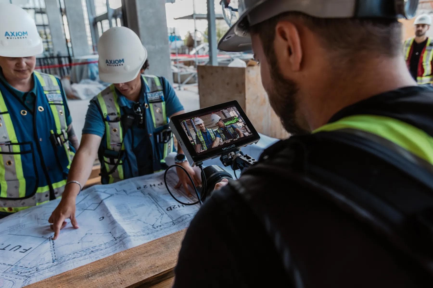
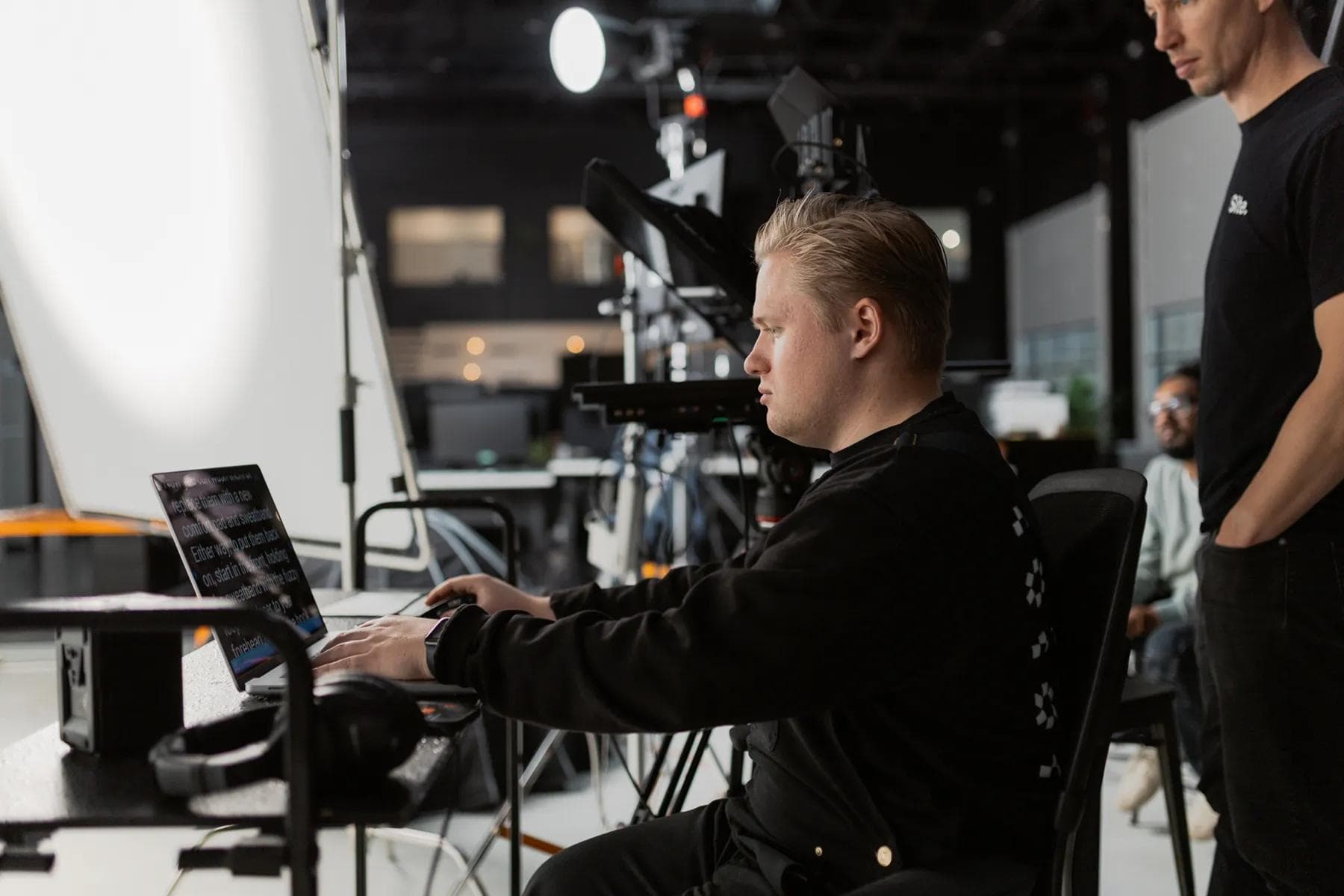
Behind the Scenes.
Our behind-the-scenes photography should feel like it was captured by a fly on the wall of our productions—a very talented fly. Every image should take advantage of the environmental lighting, but also the lighting and dynamics of our equipment. This is where we can get creative: utilizing our creativity to get a sneak peek behind our creative work. Basically, get super creative.
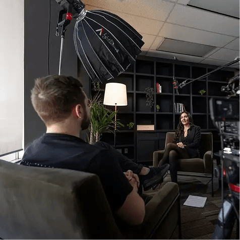
Videography.
Our internal videography often takes a documentary or talking-head form of storytelling. For b-roll and coverage, handheld is our go-to. But! Our studio interviews and shoots are more refined and planned. For feature video projects (like our swag launch), we exercise more creative freedom and intentional style. However, our brand does have its non-negotiable standards, while remaining flexible enough to experiment. But in general, it should have an edge to it that's inspired by the realness and professionalism of our industry.
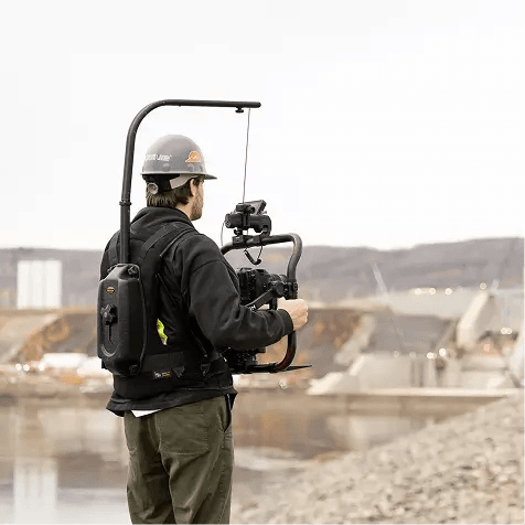
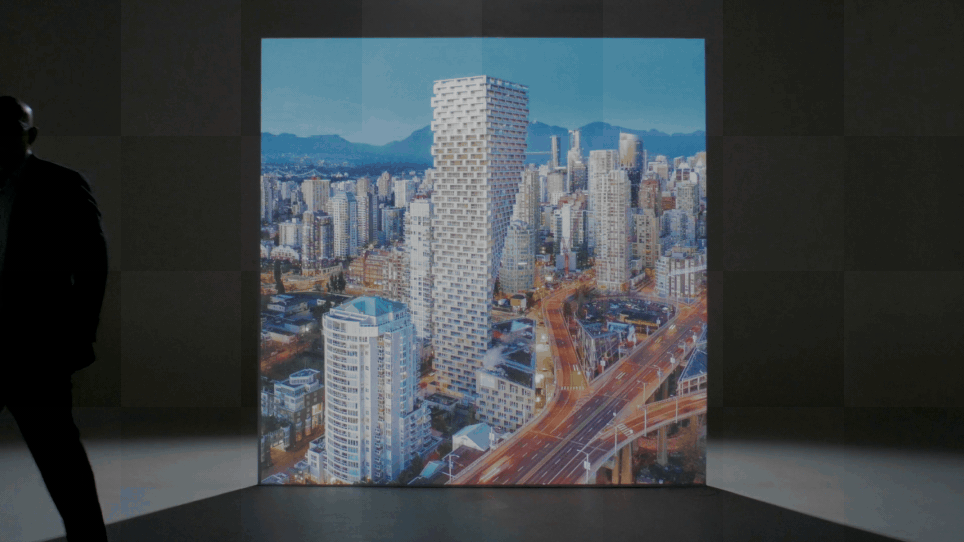
Aerial/Drone.
In a word, our drone shots should be considered: cinematic. We take our time to get the right shot with smooth motion that complements our footage on the ground. Aerial photography and videography are specialized skills, and we have those skills in spades. So we show them off in our own brand tastefully and with expertise. Our intro shot for our office-launch video demonstrates aerial shots used for our own content.
Behind the Scenes.
Footage from behind the scenes doesn't have to feel as polished as our creative productions. In fact, we prefer that. But quality is still paramount. BTS work is often something that needs to be candid and quick, so handheld camera work is preferred. But taking the time to capture beautiful establishing shots should always be on the mental shot-list—no matter how improvised and organic we intend the final cut to feel.
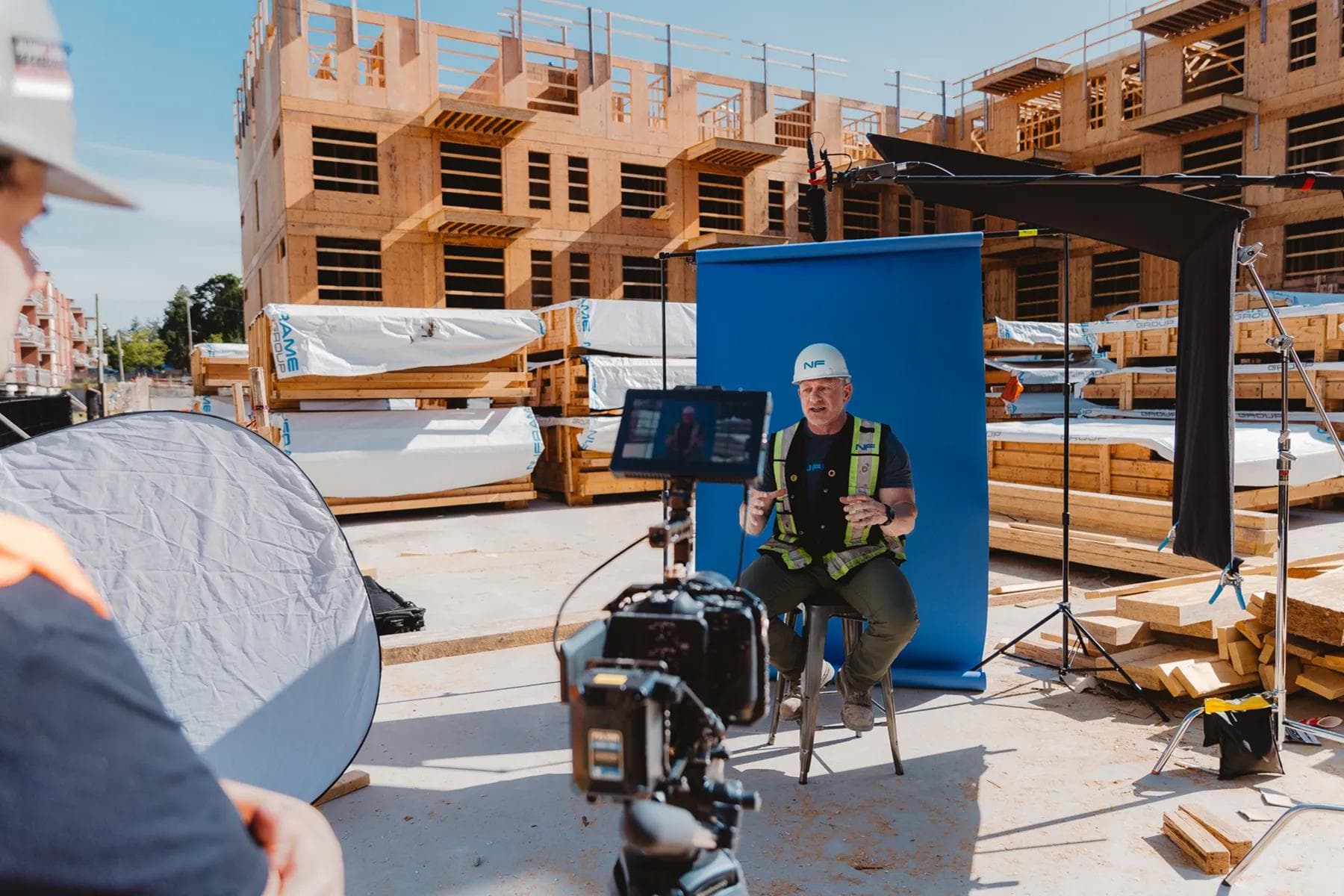
On Site.
When we are filming case studies or filming an internal video on site—not necessarily intended for behind the scenes—we treat ourselves like a client. Our footage should be intentional, artful, and, frankly, awesome. We want to capture ourselves in the best light, like we would for our clients. So we get creative with lighting and composition, capturing a good mix of wide to tight shots. And, of course, slow motion too.
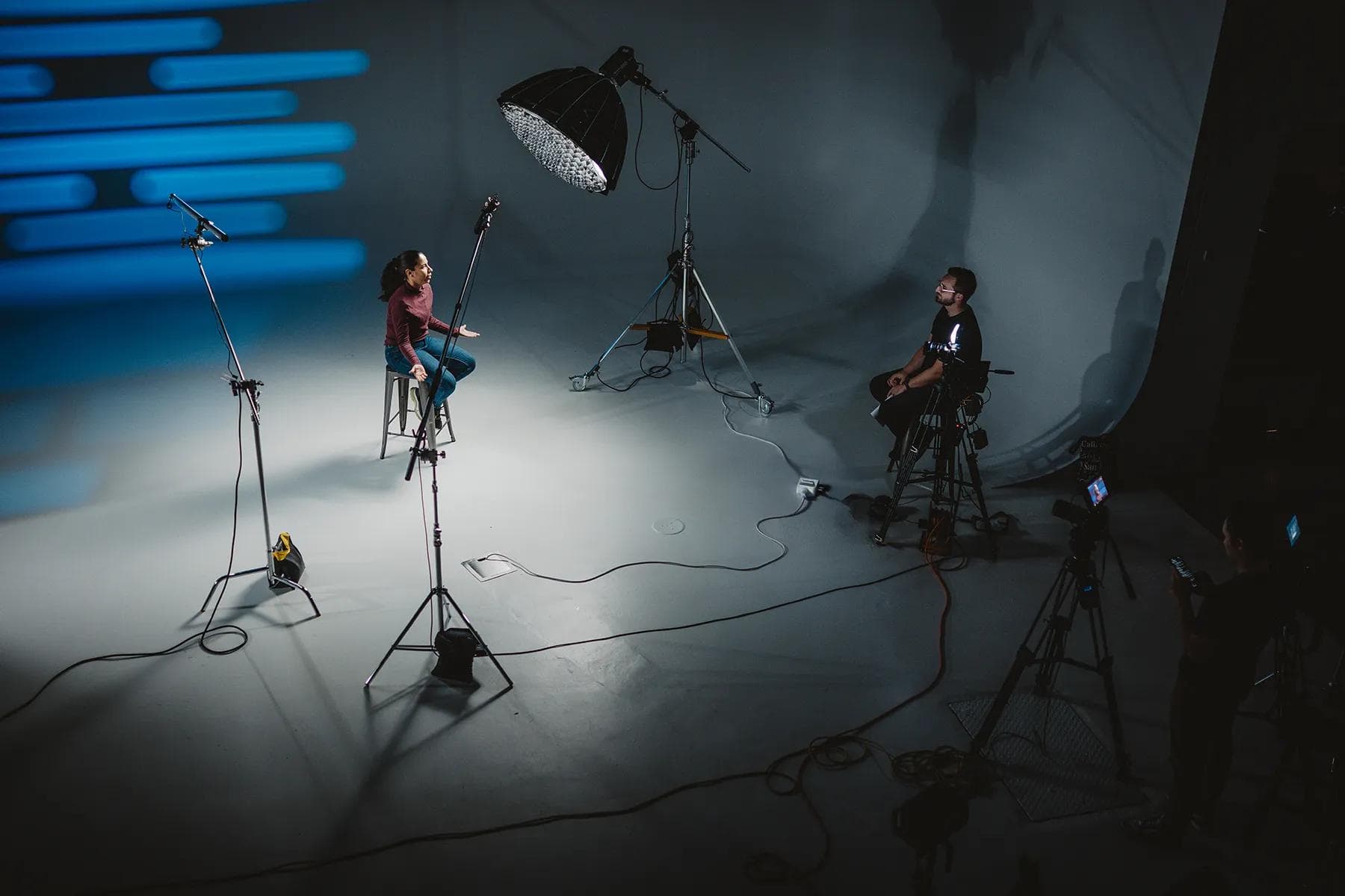
In Studio.
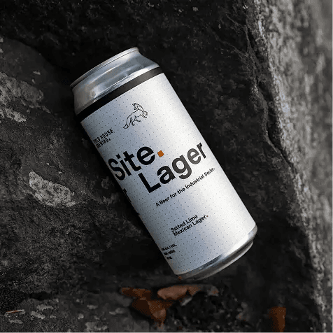
When filming ourselves in the studio, we opt for our studio's standard look the majority of the time. That means white or dark backdrop that mirrors our Onyx (dramatic dark studio) and Carbon (light professional studio) colours; those are two great moods on both sides of the spectrum. But that doesn't mean we can't think outside of the Building Block. For clearly creative projects, we have license to push our brand beyond our more professional side (example: SiteLager or SiteSwag). But we do have a carefully built brand. So we look to our brand elements: namely, the building block and brand colours. They are simple by design, so our choices in the studio should follow suit. Does every internal video need a new lighting filter or colour? No. Boredom doesn't beat brand. We look for specific creative opportunities to break our own mould when it makes sense.
Case Study.
Case studies are a showcase of our work, so we feature them in the best light. These can be interview-led, so we can give a personal touch with behind-the-scenes commentary combined with behind-the-scenes footage with well-presented final results.
Motion Graphics.
Our motion is defined by smooth speed—never slow, never rigid. We move fast with finesse. This keeps our animations dynamic and engaging but also polished. We use the Building Block for most animation elements, whether it's framing images or video, creating textures, or building icons or shapes. Our Building Block can flip or be given a glow or special effect treatment, but it should never be distorted or shifted into new shapes like triangles or rhombuses (RESIST THE RHOMBUS!). As for 3D, this is not out of bounds by any means, but it must be done tastefully. And let's not forget easing. For any visual slider users, roughtly 75%-80% is recommended for in and out key frames. At times, an "out" keyframe may look less natural, so less intensity on the motion curve may be used. In this case, 30%-40% easing can often work well for easing out of frames. Try to stick to these standards as much as possible. Our text reveals are simple, using a 5-frame fade-in and a slight position move into place: usually 10 frames between key frames with easing applied to the "in" keyframe only.
Video Elements.
Our best examples of video motion brand standards can be found in our brand launch video—plus intros to our agency reels. The building block is a critical part of our animations. This goes for the periods at the end of words too. The block can be used to reveal words when it's the period in a sentence, or it can be used to build graphics or contain images. The sky's the limit. Kidding. There are rules. Don't think outside the box/block too much.
Lower Thirds.
Site's lower thirds (across all brands) keep things simple, utilizing our Building Block as a subtle brand element at the end of names and job titles. Depending on the company, the period/block should be the brand colour. In Site's case, it's Onyx. Our current template options come in both Carbon and Onyx colourways. Please note: the animated Building Block first-position keyframe needs to be repositioned on the X-axis so that the motion starts in front of the first letter of the subject's name—allowing for the full name to be revealed by the block. For videos where the company name needs to be present (e.g., videos where team members from sister companies are represented, the vertical line on the keyboard should be used as a divider between job and company—no commas. If the video is strictly from one company (i.e., Site) just job title should cover it.
Graphic Transitions.
We don't always use transitions. But when we do, we use glitch effects. This is a quick and easy way add some dynamic visuals when transitions are needed. We do not allow for random colours within those transitions. If stock is being used, ensure it remains monochromatic in order to stay within our Carbon, middle greys, and darker Onyx. A simple black-and-white effect adjustment layer/effect, or dialling saturation down to zero, is acceptable if you do not have control over the glitch effects parameters. We commonly use the plugin "Data Glitch" by Robyte. Use this reference as your guide in selecting effects or ask your lead motion designer.
Web Elements.
We use Lottie animations, which are code-based .json files to animate our icons throughout our website. These are not GIFs, and that's by choice. Lottie animations allow for lighter file sizes and do not degrade image quality, since they are simply vector-based animations made for web. These looping icons follow our same motion standards: fast with finesse. Other elements like images are not designed to be overly flashy—just simple, clean elements that animate on-screen in a tasteful way. If it's a vector-based design element, then the animations for web should be Lottie format.
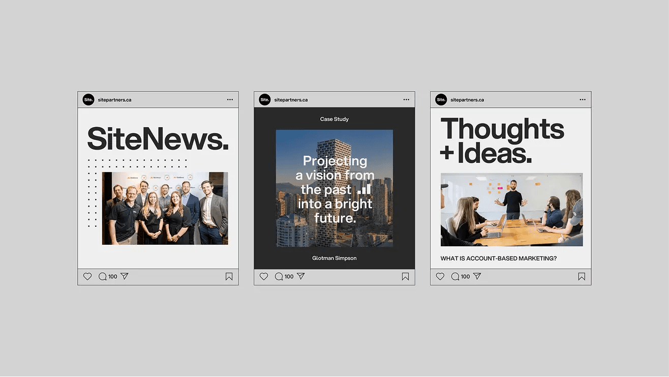
Case Studies.
Our motion-based case studies for social platforms are intended to present our work so it stands out. Particularly for websites and branding projects, presenting them with motion is a great way to showcase what we did for a client in a more engaging way. When we do this, we generally wrap it up in our brand's style. That means we can use our colour palette as backgrounds, or our Building Block to frame visuals. This isn't a hard-and-fast rule. Sometimes we can make a brand showcase for the client and ourselves—using their brand colours. But when we want to show our work using our brand as the delivery mechanism, we are free to do so.
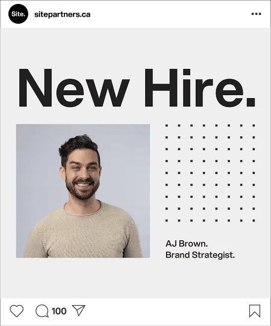
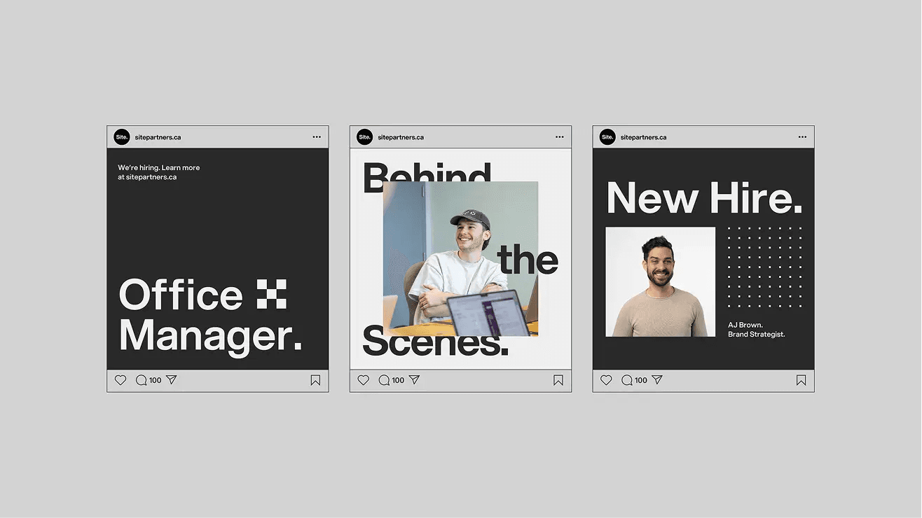
Social.
Social media is where we can make announcements with some branded motion-design flair. This can be for new hires, job openings, or even new brand launches under the Site parent brand. Again, the Building Block is always a core element for all visuals, whether it's illustrating a point or framing up images. The Building Block is the foundation of our animations.
End Logo Animation (Preferred Option).
Our logo animation is a way for all of our videos to end strong. Our preferred option uses the final frame of a video and transitions it to our logo; this uses the Building Block and scales down the final clip of the last frame of the video, shrinking it down seamlessly into the logo reveal. This option does require the use of After Effects.
End Logo (Secondary Option).
This is a second logo animation that is used in presentations as a looping gif, but it can also be used to end our branded videos. It's an image sequence that shows multiple industrial images and scales down to our logo; this is a simpler option to use if you don't want to work with the After Effects template and prefer to hard cut to a logo animation at the end of your video. It is available as both a light version and a dark version.
Sound Design.
Site's sound is a critical part of elevating our work, whether it's through music, sound effects/design, voiceover, or final mixing. Sound is what separates the amateurs from the professionals. And we always aim to add sound subtly to enhance the viewing experience.
Music.
Our music choices for our brand are designed to reflect what's modern. We used to be blues/rock, because that's what our clients wanted to back their excavator shots. And while that is still a style we use in some cases, we prefer to stay relevant and avoid the industry clichés. Musically, this can include anything from hip-hop for demo reels to indie styles for project features, to chillstep for behind-the-scenes office tours, and even cheeky/playful tunes for podcast clips. Here are some samples of music we've used. Just be cool and follow your heart.
Demo Reel Electronic.
Office Tour Chill Step.
Podcast Clip Hip-Hop Vibes.
Work Feature: Pop Electronic.
Work Feature: Hip-Hop Edge.
Sound Effects.
Our sound effects are intended to enhance. Not dominate. They should sound natural to add texture to a video: this can be the ambience of job sites or nature, subtle whooshes for transitions or text animations to imply movement, sounds of tools to add layers to industrial footage, or impact sounds for dramatic effect. In general, when pairing with music, have SFX complement the music/beats. What to avoid? Campy, cartoony, corny sounds that draw the viewers' attention. There's a time and place for this in certain videos, but in general, the Site team prefers cheese and corn on a taco, not in the sound mix.
Transition or Visual Effect Whooshes.
Job Site Ambience.
Focused Sound Effects to Complement Visuals.
Overall Sound Mixing.
Our sound mixing is all about subtlety. Meaning it should never take viewers out of the experience but, rather, immerse them in it. Music and sound effects should never overpower voices when voices are present. And when music is the driving sound, sound effects should never overpower music. That priority list again, in order of importance: voice, music, sound effects.
Voiceover Mixing.
Voiceovers must always feel intentional, confident, and premium. Mixers should prioritize clarity, consistency, and presence above all else. Levels should be balanced to sit forward without sounding compressed or harsh, with careful control of sibilance and low-end rumble. Whether using Adobe Premiere, Adobe Audition, or other professional audio software, the voice must sound natural, controlled, and unmistakably high quality. Generally, we always record on our best microphones, like our Shure SM7B in a controlled sound environment. In an emergency, AI may be used to enhance poor quality recordings—but this isn't optimal. We're pros. We have the gear. So we opt to use it to make quality voiceovers for the Site brand.
Voiceover Sample.
AI Voiceover Policy.
We use AI voiceovers for a variety of use cases. But our most common use case is in the preproduction phase, where we show clients samples of what kinds of real voices can be used in their creative (male, female, older, younger, etc.). This can be as basic as providing a voiceover sample via AI, or even for animatics that illustrate how scenes will be performed by actors. AI voiceovers can also be used in final creative, but only with client approval. Our preferred method of generating AI voiceovers is using real audio samples read by a real person, which is then processed through our preferred AI voiceover provider: Eleven Labs. Alternatively, if the performance is of good quality, text-prompted voiceovers from quality sources like Eleven Labs or Artlist.io (which now licenses from Eleven Labs) are also acceptable. These must go through approvals internally to ensure quality, and then sent off for final approval by clients.
Eleven Labs: Voice Changer.
Artlist: Text to Voice.
Brand Assets.
Brand Building Blocks.

14.1 Iconography.
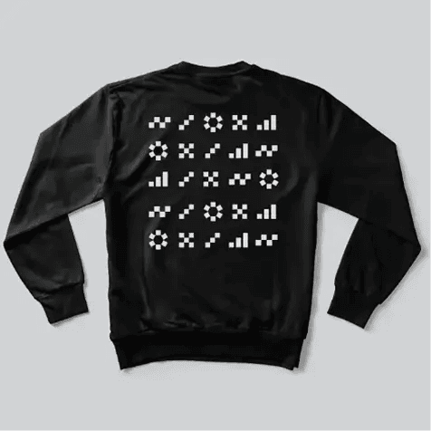
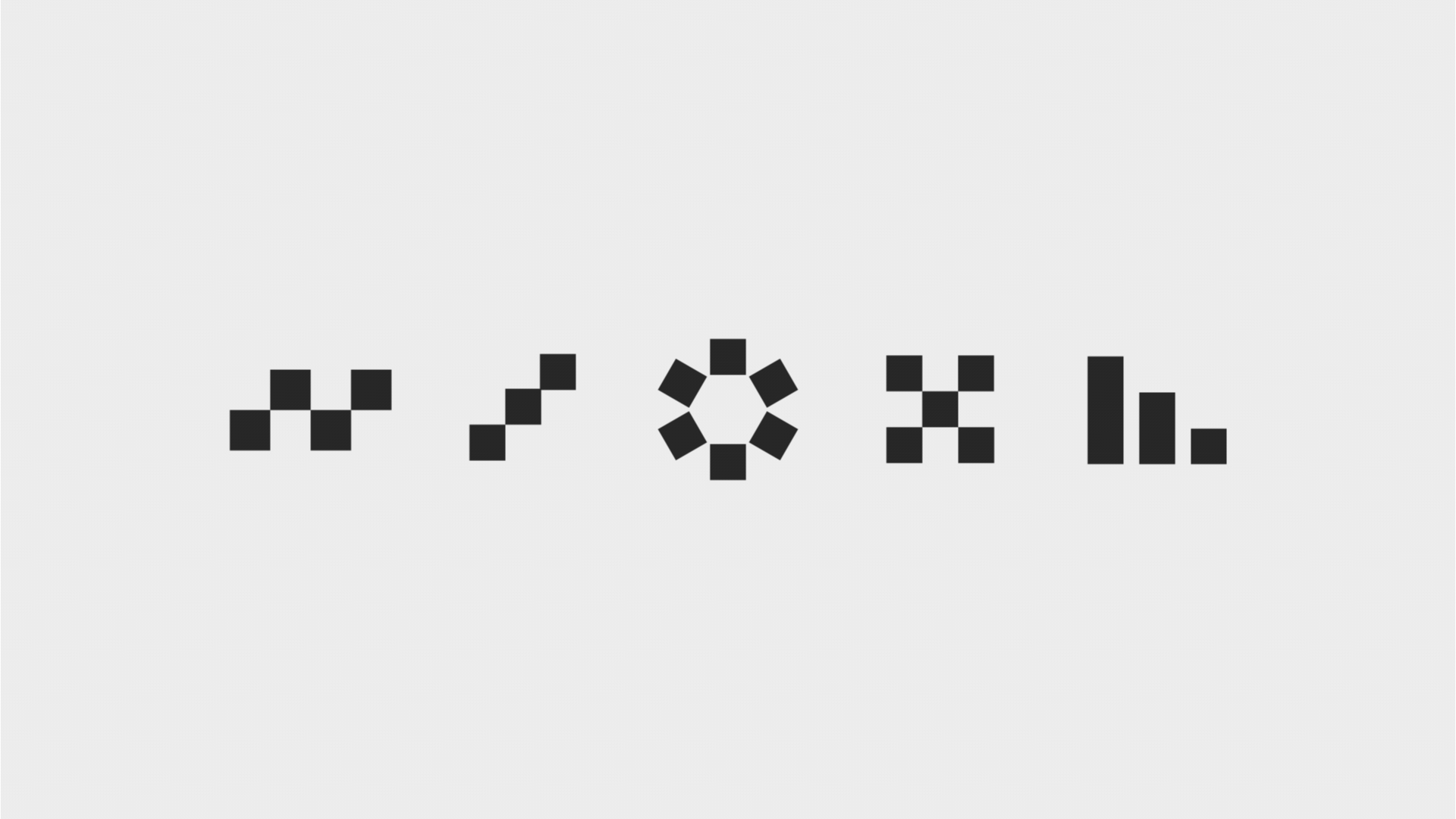
Our brand icons are, like all other extensions of our brand, made up of the Building Block from our logo/wordmark. They are a simple but definitive reflection of our core values, and represent how we approach our work. These icons can be used as a graphic device throughout our branded materials. They work great blown up on a poster or as a small accent on branded items to add visual interest.
Vision.
Strategy.
Creativity.
Collaboration.
Growth.
14.2 Iconography.
Our brand icons should be applied intentionally and consistently across the Site brand. Our icons exist in both Onyx and Carbon brand colours and can appear over backgrounds and images with sufficient contrast for proper visibility. The use of our brand icons should be limited to specific branded materials and used sparingly as a graphic device.


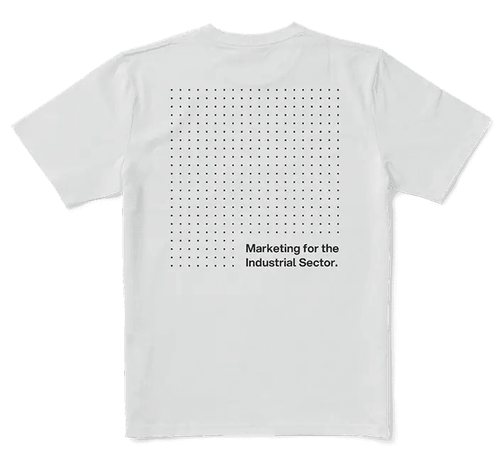
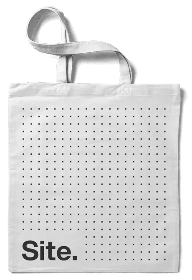
14.3 Block Pattern.
Our block pattern is a core texture/element to the Site brand. The grid is made up of small building blocks that are equally spaced apart. The grid looks best in our brand colour Onyx over our lighter brand colours (i.e., Slate or Carbon). The pattern should never be scaled bigger than 30x30 rows or columns. It should also be used sparingly throughout the Site brand.
14.4 Grid Application.
When it comes to our building-block pattern, consistency is key. It can be used as a background on social media posts, and on branded merch such as the back of T-shirts, hoodies, and tote bags. Corners of the grid pattern may be cut out and replaced with a headline or our brand logo.